Showing posts with label dinosaur. Show all posts

Monday, 7 February 2022

I'm writing a creative photography book!


Drawing photography inspiration from King Kong isn't a new idea. William Mortensen did it in the 1930's. I'm revisiting Skull Island with the help of 3D, and the model Cassandra Mellberg.

I'm writing a photography book! It's about creative photography, and it's shaping up to be different from any other book on photography I've seen.

Most photographers learn exclusively from other photographers. I believe that is a mistake. We should learn from each other, yes, but we also need to open up to learning from other sources: realist and imaginative realism painters, comic book artists, 3D artists, movie makers, and writers.

We need to understand our own history, because photography did not begin with the f/64 group, and there is great value in what was before. We even need to go beyond the arts, and learn from other sources, like neuroscience.

I'm striving to tie many different threads together into a coherent whole, and I'm doing my very best to make it entertaining and fun.

Left page above: I draw a lot of inspiration from comics, so I was more than delighted when Amryl Entertainment gave me permission to use a picture by Budd Root in the book. Budd Root is the author of the comic Cavewoman.

Right page above: I am storyboarding my ideas using 3D software. This allows me to plan my pictures in ways I could not do if I just picked up my camera and shot whatever was in front of my lens. This storyboard, One Afternoon in Pal-Ul-Don, draws inspiration from E.R. Burrough's Tarzan books.


I strive to have something eye-catching, and something useful, on every page spread. From time to time, I will publish a draft page spread, and check the responses to see if I am on the right track.
 various ideas on 
I expect the book project to keep me occupied for about a year. During that time, I also need to do at least a couple of photo sessions, to get material that illustrates various ideas and techniques.

I do hope you will enjoy reading the book as much as I am enjoying writing it!

Tuesday, 2 February 2021

Fishing Trip, and other Storyboarding Adventures


Fishing Trip

I haven't blogged regularly in awhile, so I have quite a backlog of storyboards I haven't published here. The reason for not blogging is simply that, since I can't do any photo sessions during the pandemic, I haven't had any finished pictures to show.

On the upside, once I can start shooting again, I have storyboards enough to last for years. I have included just a few of them in this post. I do hope you find them interesting. I have lots more material, so I'll try to catch up over the next few weeks...or months.

About Fishing Trip:

It is Lost World genre picture of course. I never get tired of them. It is the combination of storytelling, extreme drama, and the connections to a rich lore of literature and movies, I think, that makes them so compelling to me.

I'm going with layered storytelling here:

We see the end of a fishing trip. It was almost certainly a dramatic one, because of the size of the fish the protagonist caught.

Then there is the matter of the attacking spinosaur. That story is unresolved, with our protagonist in immediate, mortal peril. Will she die? No, at least not in my imagination. She will probably loose the fish though. 

There is also the possibility of a deux ex machina resolution, where a mosasaur or megalodon emerges from the depths and makes a quick meal of the spinosaur. I prefer stories where the protagonist survives because of her own wit, strength, and skill though, so, if I wrote the story down, I probably would not go that route.

Since I started shooting in a makeshift studio, I have avoided camera angles that make composition with 3D elements more complicated. I am deliberately trying to get away from my comfort zone, because, with just a little camera tilt here and an odd angle there, I can add more drama, and make the pictures more interesting. There is a limit to what I can do in the studio, mainly because it has a ceiling that is quite low, but I should be able to push it a little bit.

A consequence is probably that I'll make more pictures where the protagonist is kneeling, sitting, or laying down. It is an example of how constraints in the world around us, shapes the solutions we create.

Here are a couple more pictures:

Werewolves of London

I got the idea for Werewolves of London from the song of the same name, by Warren Zevon.

Even though the storyboard turned out well, I am not certain I will make a finished photo composite out of this one. The reason is that the protagonist is a bit too sad and dejected for my taste. I like pictures with an active protagonist, fighting on, no matter what the situation.

One option would be to create a series of pictures showing scenes from the same storyline. Then I am perfectly fine with showing both dramatics up and downs.

Shai-Hulud

Shai-Hulud is of course based on Frank Herbert's book Dune. I intended it as a storyboard, but the way it turned out, I do not know if there is anything to gain by making a photo-composite version.


Kermit the Conqueror

Kermit the Conqueror is a spoof on old Conan movie posters from the 80's.

Kermit the Conquered

I wasn't happy with the woman at Kermit's feet, so I had to reverse the roles in Kermit the Conquered.

Much more to my tastes.


A Plague of Demons

A Plague of Demons borrows its title from a book by Keith Laumer. Laumer's book is a Science-Fiction novel, and a very good one. Except for the title, my picture and the book have little in common.

That is it for now! Be seeing you!


Tuesday, 23 July 2019

King Kong VIII: Protector, or How to Create a Dirty Picture

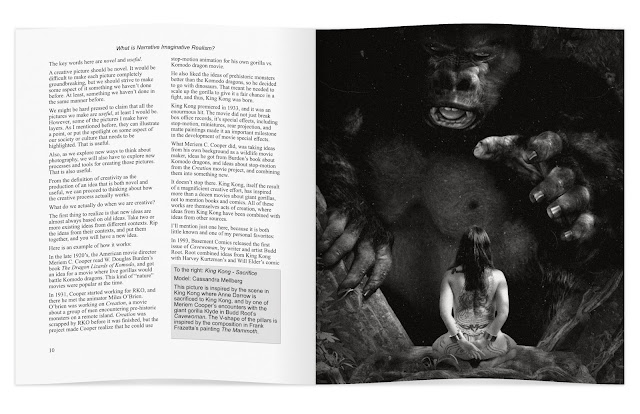
King Kong VIII: Protector is a storyboard for a future photo session. Creating storyboards allows me to catch and correct errors, and to communicate ideas with models and other people who help me create the pictures.
As you know, I draw inspiration from many different sources when I plan and create pictures. The picture above is a good example:

The basic idea and composition is from the 2005 version of King Kong. As discussed in earlier King Kong/Skull Island posts, I am taking a look at what the island might have been before Kong, during the 3,000 years humans and gorillas have lived on the island.

I do have a tendency to trip over my own love of the movies though, and recreate scenes from them, rather than using them to jump start my imagination.

Why an albino gorilla? Well, it could have been because I watched Rampage a little over a week ago, but it wasn't. The real reason was contrast. In the King Kong movie, Ann Darrow is blond, and wears clothes that are mostly bright in color. That means she shows up in bright contrast to Kong, when she stands in front of him.

My protagonist in the storyboard is much darker, and would be almost invisible against a dark background. Something had to change, and I chose to change the color of the gorilla.

Another difference is that the character in my picture is armed, and prepared to fight back. This suggests a slightly different relationship with the gorilla than the one Anne Darrow had with Kong. More of a cooperative partnership, where they help each other survive.

Getting Dirty!

There is one important thing i got from Rampage: Dirt! If you look closely at a picture of George, the giant albino gorilla in Rampage, the fur is matted an full of dirt, little twigs, and generally icky stuff that can get caught in long gorilla fur.

The gorilla model I used is excellent, but it is also squeaky clean, so I dirtied it up quite a bit. for the gorilla, I created a layer for the dirt, and then used a couple of different texture brushes to paint the dirt in. I changed the blend mode to Soft Light and reduced the opacity to 50%, to make the dirt blend in with the fur. I then created a second dirt layer and repeated the process.

Speaking of dirt, 3D images tend to have a look that is way to clean to look realistic. I tried to fix the overall look by taking the picture rendered in Daz Studio, repaint it in Dynamic Auto-Painter PRO 6, and then use the painted version as a Soft Light overlay. This dirtied up the trees and the ground a little bit, while also adding a smudge of dirt here and there to all three characters in the picture.

Growing Grass

I used only a few trees for the background, but I created many instances, to make them look like a whole forest. You can create instances manually in Daz Studio, but I had great help from Scatter Pro. Scatter Pro made it easy to create lots of trees, distribute them over and area, with random variation in placement, size, and rotation.

I did the same thing with the larger tufts of grass, but the ground still looked too flat and sterile. To combat that, I added a grass mesh. When that still did not help, I painted in some extra grass in post.

Frankly, the ground still looks to flat and sterile. I am considering reworking it in two ways:

The first is to simply use a photo of a meadow. That would give me the most realistic results, but it will be a challenge to mask the gras, so I can put objects behind it.

The second solution is to experiment with the new hair system in Daz Studio 4.11, to see if I can use that to create reasonably realistic grass.

There is a third option: Blender 2.80. However, Blender will probably take me about a year to learn, and only if I put in a lot of effort, so if I go that route, there won't be any quick results.

The Original

For the purpose of comparison, here is the original render, straight out of Daz Studio.


The Daz render had a transparent background. I used an old photo of a forest to provide background for the image. Note how much cleaner this picture looks than the finished version. Way too clean.

In addition to the changes already mentioned, I increased the contrast, reduced the saturation, and changed the color temperature to make the light a bit more like evening sunlight.

I also cropped the picture from a 2:3 to a 1:1.85 aspect ratio, partly to get rid of unnecessary foreground, and partly to give the picture more of a movie look.

Getting It Right the Last Time

I almost never create a great picture on my first try, and if I do, it has as much to do with luck as with skill.

It is very difficult to correct your mistakes unless you see them, and you won't see them until you have created a picture. Thus, the first version of a picture is usually not very good in and of itself, but it is an excellent aid to creating a better picture.

Painters often recreate the same basic picture over and over again, continuously changing and improving it as they go. Sometimes there are big changes, sometimes just minor tweaks, but the willingness to iterate is the key to improving.

I am, I must confess, a bit lax in this regard. I tend to get new ideas faster than I can create storyboards for them, and much faster than I can organize photo sessions. The result is a certain sloppiness, that ultimately can hold me back from developing as a photographer and as an artist. I tend to be too happy when I express an idea, to worry about details.

This is a weakness, and this time, I'll try to fix it. I'll make a new version of this picture correcting the things I am not happy with, just like a painter would do. There are plenty of things that can be improved, but there is one thing in particular that I find annoying about this version?

Can you guess what it is? If so, comment!

The first version may not be perfect, but I am determined to get it right the last time.

See you!


Wednesday, 25 April 2018

An Afternoon in Pal-Ul-Don (Aspect Ratios, Stephen Spielberg, and Facebook Click Optimization)


Pal-Ul-Don is a Lost World from Tarzan the Terrible a novel by Edgar Rice Burroughs. This scene is not from the book, but loosely inspired by it.

My pictures are inspired by what I read, the movies I see, comics, conversations I have with other people, and of course my own experiences.

Technically, a picture like this is much easier to create than you think. I am a photographer (well, when I am not a systems thinker that help organizations improve their processes and their organizations). When I create a picture like this, I think like a photographer, and to a large extent, work like a photographer.

For example, you may have noticed that this picture has a slightly different aspect ratio from what you are used to. That is because it is 1.85:1, which happens to be the aspect ratio Steven Spielberg chose for Jurassic Park.

Why did he do that? Movies are usually shot in a 2.4:1 aspect ratio, making the pictures very wide. his is great for a lot of things, but it gets cramped for a dinosaur that is very high.

The picture above compares the 1:85 aspect ratio Stephen Spielberg chose for Jurassic Park with the 2:3 ratio common in photography, and the 2.4:1 ratio of most movies.

If you want a T-Rex to look good, go with 1:85!

...except, of course, when something else works better. The Jurassic Park movies have been shot in a variety of different aspect ratios. Jurassic World was shot in a non-standard aspect ratio, 2:1.

If you are working in 3D, don't forget that you may need to adjust the focal length of your camera to get good results. Daz Studio uses 65mm lenses by default. For An Afternoon in Pal-Ul-Don I used a 50mm lens. Jurassic World used mostly 30mm and 60mm.

A bit of trial and error works wonders here. I decided what I wanted in frame first, then set the aspect ratio, and adjusted focal length and camera position until I was happy.

Speaking of happy...


If you value likes on Facebook more than you value creating a good picture, you might want to use the photography portrait aspect ratio, 3:2.

Because Facebook uses a narrow column for posts, using portrait format maximizes screen space.

To really see and experience the impact of a landscape format picture on Facebook, it is necessary to enlarge it by clicking on on it. Most people won't do that, even if you have created a great picture.

Instead, to maximize likes, you will either have to butcher your image and crop it down to portrait format, or design your picture for portrait format from the start.

With 3D, you can create a set of cameras using different aspect ratios, and use them to create different versions of the same scene.

Me, I am bull-headed and tend to go with the aspect ratio I like best on a picture by picture basis, even if it means the pictures won't get as popular on Facebook.

Friday, 30 March 2018

Lost World IV: Aftermath (a.k.a. Blood on Her Hands)


This is the fourth and final (unless I get more ideas) picture of Kyla.

Yes, I named the character. I thought it appropriate, since she appears in an entire series of pictures, and may appear again.

As you can see, it is immediately after the battle against the T-Rex.

I have written about my sources of ideas for this series in my earlier posts. What I wrote then, goes for this picture too. However, there is one influence worth a particular mention:

Joe Jusko! (Check out his pictures on DeviantArt. It is a treat.)

I have learned a lot just by looking at Joe Jusko's pictures. They are strong, dynamic, the colors are vibrant, the compositions lead the eye to a point-of-interest, but it is more than that. Jusko has something special, Jusko has angles.

No, not angels! Angles! In some of his pictures, he is careful not to overdo it, he uses unusual angles to create drama, and heighten emotion.

I'll link to a couple of his images on DeviantArt. Check them out and you'll see what I mean:

Here are two more. They do not use viewing angle in the same way. I am including them because I like them, and because they have female protagonists that don't take crap from anyone:
  • First oil painting in 1977 (Wow! I didn't know about this one until I researched this blog post. Except for the hair color, the woman could be my character, Kyla.)
  • Stand Off! (If you think the woman looks a lot like La of Opar, it is because she is La of Opar.)
It is very important to know...oh, screw that! I got a new idea for a picture with Kyla. Got to go.

I'll be back!

Monday, 19 March 2018

Lost World I: Dangerous Shadow


I have had the idea for this one in my head a couple of days. The idea is that sometimes, you have to knowingly walk into danger, and take on something that may be too big for you to handle.

This is one picture that I'd like to make a photographic version of. We'll see how that works out.

Where do you get inspiration for a picture like this? Well, I got it from several different sources. The Lost World theme is from books like Arthur Conan Doyle's book The Lost World, and Michael Crichton's Jurassic Park. Edgar R. Burrough's Tarzan and John Carter books are also strong influences.

In case you are wondering about the nudity: It's the norm on Barsoom, where John Carter had his adventures. Also, I budget my 3D projects carefully, and appropriate clothes weren't in the 3D budget for this month, and because I am still trying to figure out how to do nude art.

There are of course artists that have inspired too. The somewhat exaggerated proportions of the woman is inspired by the art of Boris Vallejo, Julie Bell, and Frank Frazetta. The situation, with impending danger, owes more to Joe Jusko, and perhaps FrankCho. (Frank Cho would probably have turned the idea into slapstick comedy.)

Technically, I am a photographer, not a painter, so I take a photographer's approach to creating pictures. That is, I do not create stuff. I take existing stuff, and arrange it on a scene in front of a camera, and take a picture. It just so happens, this time I used 3D objects. and the scene was created in Daz Studio.

Oh, I did a bit of post processing in Affinity Studio and Dynamic Auto-Painter. Dynamic Auto-Painter is quickly becoming a favorite of mine.

I do have a couple of more ideas on the same theme, so this may well turn into a short series of pictures.

Tuesday, 18 July 2017

Elinor and the T-Rex (65 Million Years from Home)

Noor Model Noor, Elinor Frejd, cornered by a T-Rex 75 million years from home.
Note: If you want to see more of Noor Model Noor: check out her web pages:

Noor Model Noor, Elinor Frejd, is a model in Gothenburg who does both ordinary and alternative style photo shoots. Elinor and I met in a Facebook group for models and photographers, and decided to meet to see if we could do a shoot together.

We had a first meeting in a restaurant, to see if we could come up with ideas we were both interested in. The first meeting went well, and during the following week, I sketched out ideas for shots, and sent storyboards to Elinor, so she could make wardrobe and makeup decicions, and other preparations.


We decided to keep it simple the first time around. Some of the ideas we considered would require a team, but Petra, Petri, and Julia, the photographers I usually work with, were all occupied the coming weekend. Rather than wait, we decided to save the more complicated setups for another time.

So, It was to be just Elinor, Tristan the T-Rex, and me.
Behind the Scenes: Elinor and Tristan the T-Rex get acquainted.
It was a great shoot. We started off with a series of dramatic noir-inspired, hard-boiled detective vs. rampaging T-Rex shots. Elinor really went in for the acting, and Tristan was on his best behavior. He didn't try to eat his co-star even once.

I'll publish a blog post with more shots of Noor Model Noor soon. Meanwhile, I suggest you visit her own web pages:

Monday, 26 September 2016

Out of the Frame - Skill vs. Creativity

There is a tension created by our desire to be creative, and our desire to build high levels of skill.

Being creative means to do new things. When we do new things, we are beginners. thus, creatives keep returning to the state of being a beginner, over, and over again.

Skill, on the other hand, is built through a cycle of repetition, introspection, and making small changes, over and over again, often many thousands of times.

Creativity means to take different bodies of knowledge, breaking them apart, and recombining them in new ways.

Building skill means to refine your understanding of an existing body of knowledge.

How do you hit a balance between the two?

In my case, screw the balance! I'm going for the fun stuff!

I often learn a technique first, and practice it until it is a part of my tool kit that I am comfortable, or at least familiar with. Then I start exploring the creative possibilities.

The T-Rex picture above is a case in point. It is a fun picture, but it is not really creative. At this point, I am learning to use the technique. The creative part comes later, when I have practiced, probably just barely enough, to bring off using the technique in a new context.

That is also why I skimped on photo-realism. I already know how to make a T-Rex model look more organic. That is not what I was interested in here, so I skipped it. When I am comfortable enough with creating the 3D-break-out-of-the-flat-surface look, I'll bring other techniques back in, to create more creative work, with a bit more finish.

What is your approach? How do you handle the tension between being creative, and building enough skill to do good work?

Friday, 23 September 2016

Repetitions and Variations: Dana vs. a T-Rex

Dana vs. a T-Rex. Model: Petra Brewitz
In a previous blog post, I published Dragonslayer, a quick-and-dirty, but fairly nice looking, picture of a woman facing off with a dragon. I promised to write a bit more about the picture, and how I made it. I also promised to publish a few variations on the theme.

The finished version above, Dana vs. a T-Rex, features Dana, one of the main characters in the A Rift in Time photo comic. Dana was played by Petra Brewitz in the comic, and she also modeled for the pictures in this article.

We did not start out doing a Dana picture. Petra and I had been discussing doing something with a medieval theme. That takes a lot of preparation, and quite a few props, so we decided to make something simpler, just to try things out.

Technical details: The picture above was created by applying the Painted 2 + Border filter in Comic Life 3. This filter creates a painted comic book look that works very well for many illustrations.

The original inspiration for my picture came from an illustration by the Fantasy artist Joe Jusko

If you compare Jusko's image with mine, you will see that there are a lot of differences: Mine is, how shall I put it, more modest, his is in portrait format, mine is in landscape format, his has a medieval fantasy setting while mine is urban Science-Fiction, and so on...

My picture started out being more like Jusko's. I planned to use a dragon, and I planned to shoot vertical. As I worked through several iterations, my picture diverged more and more from Jusko's. A good thing, because those differences are what separates being inspired by, from plain old copying.

Let's look at how I built the basic composition. The picture above is built from three photos.


I photographed Petra in a parking lot. She, Julia Reinhardt, and I took a photo walk after a planning meeting (I'll tell you about it in a future blog post), and since I just happened to have a toy gun in my backpack, we took the opportunity to shoot the picture when we found a fairly clean background.

I used a single hotshoe flash placed under my camera to light Petra and eliminate unwanted shadows.


I shot several photos of Petra, with both portrait and landscape orientation, and with different lighting.

The reason I switched from portrait to landscape is that it allowed Petra to take a wider stance. A wider stance leaves more space to show the monster.


I shot the background after shooting Petra. This is usually a bad idea, because it is difficult to get the angles right.

In this case, I had measured the distance between the ground and the camera when I shot Petra (1 hotshoe flash height + 3 fingers), so it was easy to replicate the angle.

I used a 35 mm lens, and f/14. I wanted to keep everything in the picture, from Petra to the portal, reasonably sharp.

The woman sitting on the bench? I cloned her out. Quite easy to do.

Oh, perhaps I should mention: Originally, I intended to use a different, more dragon friendly environment, and something much more like Joe Jusko's original.


I had shots from a pond that I had shot for another different picture. (You may remember the brachiosaur picture I published awhile back.) I thought I would be able to use one of them.

As it turned out, all of them were shot with the camera too far from the ground. I could have gone back to the pond to reshoot, but a combination of impatience and laziness made me change my mind. Instead, I shot something close at hand, which turned out to be the brick building.


Oh, the dragon... The wings look fairly good, but the rest... I just had to try anyway.

Sometimes you got to try, even though you know it won't work.

As you can see, the dragon is truly awful. The only part that works reasonably well, is the tip of the wing in the window to the left of Petra.

How do you save a picture like this? I could put in a lot of effort in an attempt to make the dragon look more organic. An easier way is to reduce detail in the entire picture. that way, the viewers expectations change, and something can suddenly be perceived as better.

Dragonslayer
I added a quick and dirty paint effect with Prisma's Mononoke filter. The filter removes a lot of details, and hides what is wrong with the dragon.

I wasn't happy though. I wanted something a bit more realistic. There was a model I had wanted to try out for awhile, a snake, made by the Schleich toy manufacturer.


The snake version looked quite good. Technically, it is the best version of them all. I did sharpen the teeth a bit in post, and I ought to have replaced, or fixed, the tongue. Nevertheless, the picture works, except for one thing!

The story! What is the story? Why is there a giant snake in something that looks like a factory? (The dragon had the same problem, but the model was so ugly I never had to worry about the story.)
In this version, the protagonist is aware it is weird that a giant snake appears in a doorway. She expected a T-Rex, so there is a bit of a twist left for the viewer to wrap herself around.
Here is a useful storytelling trick:

When there is a completely illogical gap in your story, make your protagonist aware of it!

In the version above, the protagonist didn't expect to be face-to-face with a giant snake. She expected a T-Rex, so the viewer may still not quite get what is going on, which is intentional.

Viewers familiar with A Rift in Time will be in on the secret: It's a time-travelling T-Rex! They might also guess that the person facing off with the T-Rex is an RRC operative, and they might even recognize Dana.


Just in case you were wondering, this is what the Schleich snake model looks like. It is less than five centimeters high (about two inches).

Once I got this far, it was natural to simplify the story a bit. What would it look like if Dana encounters the T-Rex she expected?

Dana vs. T-Rex, photo version
In the version above, the T-Rex looks pretty good, but it is not photo realistic. I have solved that problem before, by adding organic textures, but I decided to go the easier route, and make a comic panel.

The T-Rex
The final version
And here we are again, with the final version...or maybe not. There are still plenty of variations I could explore.