I am a member of a photography group that recently banned all photos of dogs, ducks, hamsters, geese, and a couple of other animals. The reason was not a sudden hostility towards pets per sé, but the group had been flooded by bad animal photos.
The group admin had, several times, tried to encourage members to think before posting, and only post their very best photos. It did not work. The people who posted really bad photos seemed unable to distinguish between high quality and cr*p. This phenomenon is fairly common, its most extreme form is called
The Anosognosic's Dilemma. (An anosognosic is a person who, due to a lack of self awareness, is completely unable to judge her own level of competence. We all suffer from milder forms of agnosognosia. The effects can become very visible in photography groups.)
While most of us are not full blown anosognosics, I think most of us photography enthusiasts have slipped and posted shots we should not have.
Sometimes, it is because the shot is bad, sometimes it is best to refrain from posting even a good shot, because the subject matter has been done to death.
Here are six things you should think at least three times about before posting. It also happens to be six photographic sins I myself have committed:
Pets
 |
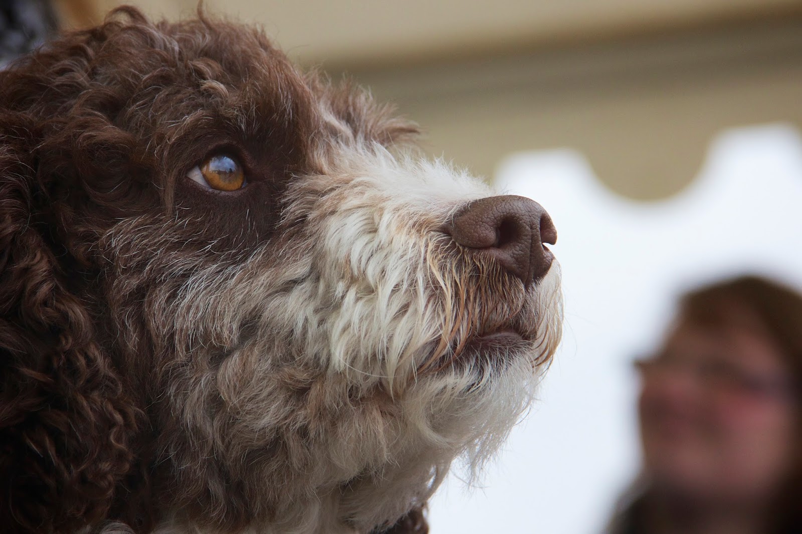
| Think twice, or thrice, before posting even a good shot of a dog. You may like it, the pet owner will love it, but to most other people it simply is not interesting. |
Dogs, cats, rabbits, horses, etc., are cute, and that is the reason why photos of them have been done to death. The downside is that interesting pet photos are almost as rare as hair on an egg.
A photo of a dog may be very appealing to the dog owner, people who know the dog, and to the photographer. I like the photo above. The dog was very nice and friendly, I like the soulful expression, and the composition.
Still, it is a very common kind of photo. While I would not hesitate to post it in the
Dogs group on Google+, I would not post it in a high quality photography group, simply because it is not original enough. (Well, I actually did, but I have grown wiser since then. Maybe...)
I like animals, and my new web site (, which is'nt quite ready for publication yet,) even has a pet section. I do photograph pets and other animals commercially, and for fun. However, that does not make it a good idea to post my animal photos in photography groups. Neither do I post them on
1x.com, the photo site where I post my favorite shots.
You might wonder what an original pet photo might look like. Well, you'd have to capture an animal doing something unusual, or an animal having an unusual feature.
A dog with sectoral heterochromia makes an interesting subject. Though the condition isn't all that unusual in dogs, it does bring interest to the shot.
If you want more examples of pet shots that are interesting, I have set up a
small collection of photos on a Pinterest board. The photos are from
1x.com. Go there and search for your favorite animal if you want more.
Sunsets
Like so many others, I have watched a great sunset, and caught in the mood, brought out my camera and clicked away. The problem is that though the sunset looks great in real life, it is just not that interesting when caught in a photo.
A nice sunset can make a fantastic
background for a great photo, but a sunset on its own is too common to be interesting. The story in a sunset photo is "the sun sets, again". That is an old story. You have to add something else to make it worth looking at.
One of the simplest things you can do ist to shoot a silhouette in a sunset scene. In the photo above, I went one small step further, and used the reflection of the sunset in the water as the backdrop for the photo.
Landscapes
 |
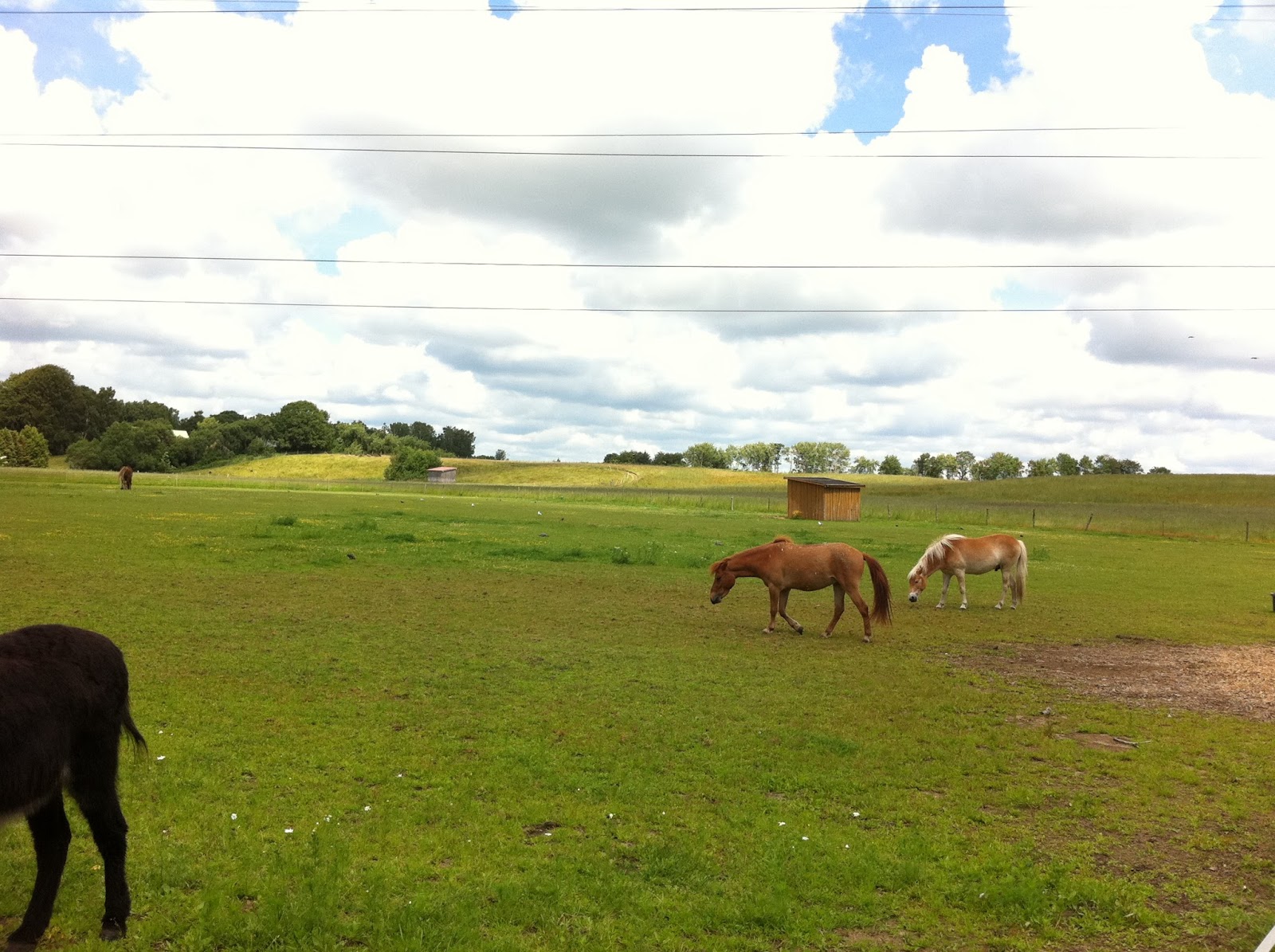
| Lots of people will start nitpicking on the technical issues, like very poor composition, and blown out highlights, and miss the main problem: It is a boring photograph. There is no interesting story in it. |
Well, what can I say? Even worse than the awful, walk-up-shot composition of this picture, is the fact that there is nothing interesting there. Horses are nice, but these ones are not doing anything interesting.
This is a horrible shot from a technical point of view, with the horse's ass at the left edge, the blown out clouds, and the horizon in the middle of the photograph.
Where lots of people get it wrong, is that they start picking up on such details, and discuss how to correct them, when the real problem is that the scene is boring.
I remember the day I took this shot, and it was a great day. I visited a farm with my son and my mother, and we had great fun. I was also, at the time, completely unfettered by good taste in photography, and had no skill whatsoever.
I have kept the photo to remind me of that great day, but, except in an article such as this, it should not be inflicted on people who have done me no harm. They deserve better.
Family
 |
| A cringeworthy photo can be great fun for you and your family, but everyone else will just...cringe. |
I love my family photos. My family also loves family photos. Only a couple of days ago, my ex-wife (who is a close friend) and I sat down, collected the best photos of our son from last year, and made a photo calendar. Don't worry, the photo above was
not included!
My son and I had a lot of fun when we took the shot above, using the camera in my laptop. I love the photo because of the feeling and the memory, but the photo in itself is not good.
Flowers
 |
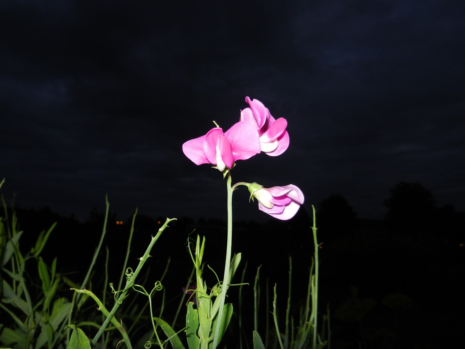
| Don't do this! Just don't. Oh the photographic sins I have committed. Perhaps the worst thing is that when I took this photo, I decided to keep it. The reason I keep it now, is that I want to keep a record showing my progress from truly awful to...well, at least not this awful. |
Flowers are great for practicing photography. They never refuse to have their picture taken. They don't walk away while you fiddle with camera settings, though they may wilt a bit if you take very long. And, flowers are beautiful.
So, taking a lot of flower photos is a good idea, it is great practice. Just don't post them...
Of course there are flower shots worth posting, but they are fairly rare, and they often require a bit of preparation.
Photos of beautiful flowers are so common that the beauty itself is not enough to warrant publishing a shot. Make your flower photo tell a story! Then you have something to publish.
To take the shot of the rose, I first dried the rose, I bought theatre blood, and set up the scene on my living room table. I put a white paper on the table, and carefully overexposed the shot. In post, I blew out the background completely, desaturated my hand, darkened the blood, did some work on the rose, and presto: A picture that tells a story about love, roses, and death.
Food
Judging from photos I see on Facebook and Google+, it seems lots of people believe I am interested in what they are eating.
Believe me when I say, I am not! I do not even want to know what my close friends are eating. I am interested in food photography, but that is something completely different.
I have seen bad, completely unappealing food photos, even from very good photographers. It seems like there is no taste involved when people shoot their food.
If you want to shoot food, check out the
food photos of Herminia Dosal first. If what you are eating does not look as good, by all means, shoot it for practice, but don't publish.
 |
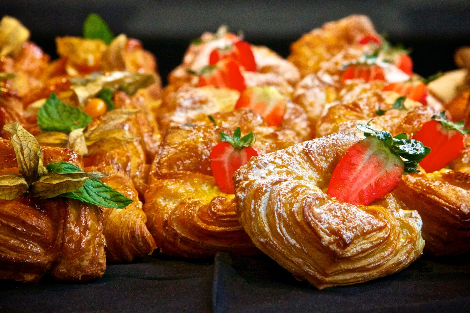
| Shoot food that looks good. Be prepared to do a lot of post processing. With this photo, I increased saturation, removed pieces of leaves, and lots of crumbs on the black cloth. |
If you decide to publish a food photo anyway, remember that it is not about what tastes good, but about what
looks good!
This article was partially inspired by
Are you still hunting for the shot, a blog post by Scott Kelby. Not all, but many, of the bad photos I see, and the ones I have taken myself, are "hunting for the shot" photos.
All photographers, even the best ones in the world, take bad photos. The great photographers do it much less often, but they still do. You rarely see those bad photos, because good photographers are very careful in selecting the photos they will show.
Most of us can improve our published photos a lot, just by being a bit more selective.
Now, I'm off to take much better shots than the ones in this article. I hope you will do likewise.


