Showing posts with label animal. Show all posts

Tuesday, 23 July 2019

King Kong VIII: Protector, or How to Create a Dirty Picture

King Kong VIII: Protector is a storyboard for a future photo session. Creating storyboards allows me to catch and correct errors, and to communicate ideas with models and other people who help me create the pictures.
As you know, I draw inspiration from many different sources when I plan and create pictures. The picture above is a good example:

The basic idea and composition is from the 2005 version of King Kong. As discussed in earlier King Kong/Skull Island posts, I am taking a look at what the island might have been before Kong, during the 3,000 years humans and gorillas have lived on the island.

I do have a tendency to trip over my own love of the movies though, and recreate scenes from them, rather than using them to jump start my imagination.

Why an albino gorilla? Well, it could have been because I watched Rampage a little over a week ago, but it wasn't. The real reason was contrast. In the King Kong movie, Ann Darrow is blond, and wears clothes that are mostly bright in color. That means she shows up in bright contrast to Kong, when she stands in front of him.

My protagonist in the storyboard is much darker, and would be almost invisible against a dark background. Something had to change, and I chose to change the color of the gorilla.

Another difference is that the character in my picture is armed, and prepared to fight back. This suggests a slightly different relationship with the gorilla than the one Anne Darrow had with Kong. More of a cooperative partnership, where they help each other survive.

Getting Dirty!

There is one important thing i got from Rampage: Dirt! If you look closely at a picture of George, the giant albino gorilla in Rampage, the fur is matted an full of dirt, little twigs, and generally icky stuff that can get caught in long gorilla fur.

The gorilla model I used is excellent, but it is also squeaky clean, so I dirtied it up quite a bit. for the gorilla, I created a layer for the dirt, and then used a couple of different texture brushes to paint the dirt in. I changed the blend mode to Soft Light and reduced the opacity to 50%, to make the dirt blend in with the fur. I then created a second dirt layer and repeated the process.

Speaking of dirt, 3D images tend to have a look that is way to clean to look realistic. I tried to fix the overall look by taking the picture rendered in Daz Studio, repaint it in Dynamic Auto-Painter PRO 6, and then use the painted version as a Soft Light overlay. This dirtied up the trees and the ground a little bit, while also adding a smudge of dirt here and there to all three characters in the picture.

Growing Grass

I used only a few trees for the background, but I created many instances, to make them look like a whole forest. You can create instances manually in Daz Studio, but I had great help from Scatter Pro. Scatter Pro made it easy to create lots of trees, distribute them over and area, with random variation in placement, size, and rotation.

I did the same thing with the larger tufts of grass, but the ground still looked too flat and sterile. To combat that, I added a grass mesh. When that still did not help, I painted in some extra grass in post.

Frankly, the ground still looks to flat and sterile. I am considering reworking it in two ways:

The first is to simply use a photo of a meadow. That would give me the most realistic results, but it will be a challenge to mask the gras, so I can put objects behind it.

The second solution is to experiment with the new hair system in Daz Studio 4.11, to see if I can use that to create reasonably realistic grass.

There is a third option: Blender 2.80. However, Blender will probably take me about a year to learn, and only if I put in a lot of effort, so if I go that route, there won't be any quick results.

The Original

For the purpose of comparison, here is the original render, straight out of Daz Studio.


The Daz render had a transparent background. I used an old photo of a forest to provide background for the image. Note how much cleaner this picture looks than the finished version. Way too clean.

In addition to the changes already mentioned, I increased the contrast, reduced the saturation, and changed the color temperature to make the light a bit more like evening sunlight.

I also cropped the picture from a 2:3 to a 1:1.85 aspect ratio, partly to get rid of unnecessary foreground, and partly to give the picture more of a movie look.

Getting It Right the Last Time

I almost never create a great picture on my first try, and if I do, it has as much to do with luck as with skill.

It is very difficult to correct your mistakes unless you see them, and you won't see them until you have created a picture. Thus, the first version of a picture is usually not very good in and of itself, but it is an excellent aid to creating a better picture.

Painters often recreate the same basic picture over and over again, continuously changing and improving it as they go. Sometimes there are big changes, sometimes just minor tweaks, but the willingness to iterate is the key to improving.

I am, I must confess, a bit lax in this regard. I tend to get new ideas faster than I can create storyboards for them, and much faster than I can organize photo sessions. The result is a certain sloppiness, that ultimately can hold me back from developing as a photographer and as an artist. I tend to be too happy when I express an idea, to worry about details.

This is a weakness, and this time, I'll try to fix it. I'll make a new version of this picture correcting the things I am not happy with, just like a painter would do. There are plenty of things that can be improved, but there is one thing in particular that I find annoying about this version?

Can you guess what it is? If so, comment!

The first version may not be perfect, but I am determined to get it right the last time.

See you!


Friday, 20 July 2018

Pictorialism vs. Neo-Pictorialism vs. Contemporary Pictorialism

Bareback Riders - Pictorialist Version
In this article I will use the same basic photo to create three very different pictures, a pictorialist version, a neo-pictorialist version, and, for want of a better term, a contemporary pictorialist version.

Hang on! You are in for a ride!

The slow bit: A brief history of pictorialism

 Pictorialism is a photographic style that was popular from 1885 to about 1920. The style all but disappeared for a long time, but it was rediscovered in the 90's.

The rising interest in the original pictorialists and their pictures, also kindled an interest in recreating their style. Behold, neo-pictorialism was born!

Neo-pictorialist pictures are stylistically very similar to pictorialist pictures, but there are important differences. If there weren't, this article would end here.

What about contemporary pictorialism? First of all, I invented the term. There are people today, who do what the pictorialists did a hundred years ago. Because there is a 100 year gulf separating the original pictorialists from the contemporary ones, the technology has changed, our society, and social norms, have changed. Therefore, a contemporary pictorialist picture can look very different from a pictorialist picture from 1918.

Enough with the history lession! Let's get on with creating the pictures!

The boring base photograph

Base Photo: Bushes and Borgholm Castle
The base photograph is a picture of some boring shrubs. You can see the Borgholm Castle in the background, but as castle photos go, this one is pretty much a dud. The castle is very interesting, but you cannot see that in this picture.

Let's take this unremarkable photo, and have some fun with it!

Neo-pictorialist version

Bareback Riders: Neo-Pictorialist Version. Note the absence of horses and riders.
Let's begin by giving the picture the neo-pictorialist treatment. When people talk about creating pictorialist pictures today, they usually mean neo-pictorialist pictures.

Neo-pictorialism is mostly a technical exercise. The objective is to make a picture stylistically similar to an old pictorialist picture. The closer you get, the more you have succeeded.

Pictorialists in the early 20th century wanted to evoke emotion. They wanted to create art. To do that, they turned to painters for inspiration. Consequently, they often wanted their pictures to look like paintings.

To create painterly effects, the pictorialists used a great variety of tricks. Anything that worked was okay to use. They often blurred their pictures, they hand-colored them, dodged, burned, used early composition techniques...

Neo-pictorialists recreate the look of the pictorialist photos, much like historical reenactment societies recreate old battles.

Thus, if we take our base photo, and make it look stylistically like a pictorialist photo, then we have a neo-pictorialist photo.

Why are there no horse and riders in our neo-pictorialist version of the photo? Because there is no reason to have them there. Only the style is important. The content does not matter, as long as it does not look too modern. Consequently, neo-pictorialist pictures are often pictures of nature, landscapes, forests. A really old car is okay to shoot, but a modern car is not. To some neo-pictorialists, shooting with old lenses and using the original processes is a matter of pride.

Pictorialist version

Bareback Riders: Pictorialist Version
In the pictorialist (1920) version of the photo, the style is exactly the same as in the neo-pictorialist version, but the content is different. Why?

Because, to a pictorialist, content was important. Pictorialists asked questions like:

Is it beautiful?
Is it scary?
Does it tell a story?
Does it convey an idea?
...and so on

A pictorialist uses whatever means available to further the purpose of the picture. It is that simple.

They did not care about using the "correct" process, or whether the picture conformed to genre conventions. They used whatever means they had. The style is as much a result of technical limitations, as of aesthetic considerations.

For this picture, I have stuck with the convention of making the photo look like a painting, but the technique I use for doing so is completely modern. In case you are curious, I used Dynamic Auto-Painter, a tool that analyses the photo, and with a little guidance from me, recreates it from scratch, as a painting.

Making their pictures look like paintings was a means to an end, not an end in itself. It was a convenient way to help viewers relate to the photos by relating the photos to something the audience already knew. (A bit like when the iPhone was introduced. The iPhone is a miniature mobile multi-purpose device. Most of the time it is used, it is used as something other than a phone. Calling it a phone made it easier for people to relate to it.)

Nudes are common in pictorialism because the nude human form evokes feelings. Most pictures are of nude women, because most of the photographers were male. There are exceptions though. There were female photographers, and photos of nude males.

Note the difference between pictorialist and neo-pictorialist:
  • The pictorialist uses cutting edge technology and processes to express emotion and ideas.
  • The neo-pictorialist tries to emulate the results of processes used by pictorialists in the period 1885-1920.
What would a pictorialists do today? I am glad you asked.

Contemporary Pictorialism

Bareback Riders: Contemporary Pictorialism
A contemporary pictorialist would ask the same, or similar, questions that a pictorialist would:

Is it beautiful?
Is it scary?
Does it tell a story?
Does it convey an idea?
Do I have to ask exactly the same questions a pictorialist would have asked 100 years ago? (Hint: The answer is NO!)


If you have read my blog posts about the Gothenburg Nudes series, you know that the basic idea was to separate nudity and objectification, for the purpose of making room for appreciation.

This basic idea guided the design of each picture, and of the series as a whole. The Öland Nudes series uses the same basic idea, but it is tailored for a slightly different audience.

People tend to relate to places they know, so I use familiar locations to trigger interest, before I hit t
hem with abstract concepts.

I admit, it does not work perfectly. Some people see nipples, and after that, they see nothing else. This happens both with those who like nipples, and those who don't. Neither group is my target audience.

My target audience is the group of people who appreciates both the beauty of the human form, and abstract reasoning...and especially those who either live in Gothenburg or on Öland.

If you live elsewhere, please do not feel left out. You can appreciate Gothenburg and Öland even if you do not live there.

That is the difference between pictorialism, neo-pictorialism, and contemporary pictorialism as I see it. Feel free to disagree. If you do, please also feel free to comment. I am interested in your opinion, whether your argument changes my mind or not.

Thursday, 17 May 2018

Kyla: The Hunting of the Snake


The title of this piece, The Hunting of the Snake, is a horribly bad pun. I got the idea from Lewis Carrol's poem The hunting of the Snark.

There are many different interpretations of the poem. Lewis Carrol was once asked if it was an allegory for the search for happiness, and he wrote in a letter that it was.

I have always been fascinated by the last two verses:

 They hunted till darkness came on, but they found
   Not a button, or feather, or mark,
By which they could tell that they stood on the ground
   Where the Baker had met with the Snark.

In the midst of the word he was trying to say,
   In the midst of his laughter and glee,
He had softly and suddenly vanished away—
   For the Snark was a Boojum, you see.

Happiness is a Snark. We hunt for it, but when we catch it, it may well turn out to be a Boojum.

Well, unlike the Baker, at least most of the time, we can survive the Boojum, and live to hunt another Snark. Some of us even find it.

In case you wonder, I made the picture first, and came up with the title, and thus also the interpretation, afterwards.

I suppose, it is a case of cause following effect.

Technically, I created the original picture in Daz Studio.


I used three lights for this picture:
  • The default DAZ HDRI environment, set at 0.3 strength. This gave me a basic low level ambient lighting. The level you can see in the background.
  • A spotlight with 10x10 m area, placed 10 m straight above Kyla and the Constrictor. This gave me a fair amount of light on the trees beyond the large fallen one, and brightened Kyla and the constrictor a bit.
  • A smaller spotlight, 5x5 m, 8 m up, with a more narrow beam of light, focused on Kyla and the constrictor.
The end result is that the further away you get from Kyla and the snake, the darker the picture becomes. Some of my recent pictures have had to flat lighting, and I wanted to fix that.

I painted the picture using Dynamic Auto-Painter.

Here is the first version. I wasn't quite happy with it. I think you can see why:


In this version, the background trees are almost obliterated by the muddy, brown underpaint. I had decided to leave reduce the detail in the background, but the DAP default was a bit too much.

Simple solution: I did a bit of post brushwork in DAP. The reason I mention it, is because if you do the same, do set the opacity of the brush down a bit. The postprocessing brushes have higher default opacity than the same brush used while DAP is autopainting. This can trick you into making postprocessing effects too strong.

Monday, 26 September 2016

Out of the Frame - Skill vs. Creativity

There is a tension created by our desire to be creative, and our desire to build high levels of skill.

Being creative means to do new things. When we do new things, we are beginners. thus, creatives keep returning to the state of being a beginner, over, and over again.

Skill, on the other hand, is built through a cycle of repetition, introspection, and making small changes, over and over again, often many thousands of times.

Creativity means to take different bodies of knowledge, breaking them apart, and recombining them in new ways.

Building skill means to refine your understanding of an existing body of knowledge.

How do you hit a balance between the two?

In my case, screw the balance! I'm going for the fun stuff!

I often learn a technique first, and practice it until it is a part of my tool kit that I am comfortable, or at least familiar with. Then I start exploring the creative possibilities.

The T-Rex picture above is a case in point. It is a fun picture, but it is not really creative. At this point, I am learning to use the technique. The creative part comes later, when I have practiced, probably just barely enough, to bring off using the technique in a new context.

That is also why I skimped on photo-realism. I already know how to make a T-Rex model look more organic. That is not what I was interested in here, so I skipped it. When I am comfortable enough with creating the 3D-break-out-of-the-flat-surface look, I'll bring other techniques back in, to create more creative work, with a bit more finish.

What is your approach? How do you handle the tension between being creative, and building enough skill to do good work?

Friday, 23 September 2016

Repetitions and Variations: Dana vs. a T-Rex

Dana vs. a T-Rex. Model: Petra Brewitz
In a previous blog post, I published Dragonslayer, a quick-and-dirty, but fairly nice looking, picture of a woman facing off with a dragon. I promised to write a bit more about the picture, and how I made it. I also promised to publish a few variations on the theme.

The finished version above, Dana vs. a T-Rex, features Dana, one of the main characters in the A Rift in Time photo comic. Dana was played by Petra Brewitz in the comic, and she also modeled for the pictures in this article.

We did not start out doing a Dana picture. Petra and I had been discussing doing something with a medieval theme. That takes a lot of preparation, and quite a few props, so we decided to make something simpler, just to try things out.

Technical details: The picture above was created by applying the Painted 2 + Border filter in Comic Life 3. This filter creates a painted comic book look that works very well for many illustrations.

The original inspiration for my picture came from an illustration by the Fantasy artist Joe Jusko. 

If you compare Jusko's image with mine, you will see that there are a lot of differences: Mine is, how shall I put it, more modest, his is in portrait format, mine is in landscape format, his has a medieval fantasy setting while mine is urban Science-Fiction, and so on...

My picture started out being more like Jusko's. I planned to use a dragon, and I planned to shoot vertical. As I worked through several iterations, my picture diverged more and more from Jusko's. A good thing, because those differences are what separates being inspired by, from plain old copying.

Let's look at how I built the basic composition. The picture above is built from three photos.


I photographed Petra in a parking lot. She, Julia Reinhardt, and I took a photo walk after a planning meeting (I'll tell you about it in a future blog post), and since I just happened to have a toy gun in my backpack, we took the opportunity to shoot the picture when we found a fairly clean background.

I used a single hotshoe flash placed under my camera to light Petra and eliminate unwanted shadows.


I shot several photos of Petra, with both portrait and landscape orientation, and with different lighting.

The reason I switched from portrait to landscape is that it allowed Petra to take a wider stance. A wider stance leaves more space to show the monster.


I shot the background after shooting Petra. This is usually a bad idea, because it is difficult to get the angles right.

In this case, I had measured the distance between the ground and the camera when I shot Petra (1 hotshoe flash height + 3 fingers), so it was easy to replicate the angle.

I used a 35 mm lens, and f/14. I wanted to keep everything in the picture, from Petra to the portal, reasonably sharp.

The woman sitting on the bench? I cloned her out. Quite easy to do.

Oh, perhaps I should mention: Originally, I intended to use a different, more dragon friendly environment, and something much more like Joe Jusko's original.


I had shots from a pond that I had shot for another different picture. (You may remember the brachiosaur picture I published awhile back.) I thought I would be able to use one of them.

As it turned out, all of them were shot with the camera too far from the ground. I could have gone back to the pond to reshoot, but a combination of impatience and laziness made me change my mind. Instead, I shot something close at hand, which turned out to be the brick building.


Oh, the dragon... The wings look fairly good, but the rest... I just had to try anyway.

Sometimes you got to try, even though you know it won't work.

As you can see, the dragon is truly awful. The only part that works reasonably well, is the tip of the wing in the window to the left of Petra.

How do you save a picture like this? I could put in a lot of effort in an attempt to make the dragon look more organic. An easier way is to reduce detail in the entire picture. that way, the viewers expectations change, and something can suddenly be perceived as better.

Dragonslayer
I added a quick and dirty paint effect with Prisma's Mononoke filter. The filter removes a lot of details, and hides what is wrong with the dragon.

I wasn't happy though. I wanted something a bit more realistic. There was a model I had wanted to try out for awhile, a snake, made by the Schleich toy manufacturer.


The snake version looked quite good. Technically, it is the best version of them all. I did sharpen the teeth a bit in post, and I ought to have replaced, or fixed, the tongue. Nevertheless, the picture works, except for one thing!

The story! What is the story? Why is there a giant snake in something that looks like a factory? (The dragon had the same problem, but the model was so ugly I never had to worry about the story.)
In this version, the protagonist is aware it is weird that a giant snake appears in a doorway. She expected a T-Rex, so there is a bit of a twist left for the viewer to wrap herself around.
Here is a useful storytelling trick:

When there is a completely illogical gap in your story, make your protagonist aware of it!

In the version above, the protagonist didn't expect to be face-to-face with a giant snake. She expected a T-Rex, so the viewer may still not quite get what is going on, which is intentional.

Viewers familiar with A Rift in Time will be in on the secret: It's a time-travelling T-Rex! They might also guess that the person facing off with the T-Rex is an RRC operative, and they might even recognize Dana.


Just in case you were wondering, this is what the Schleich snake model looks like. It is less than five centimeters high (about two inches).

Once I got this far, it was natural to simplify the story a bit. What would it look like if Dana encounters the T-Rex she expected?

Dana vs. T-Rex, photo version
In the version above, the T-Rex looks pretty good, but it is not photo realistic. I have solved that problem before, by adding organic textures, but I decided to go the easier route, and make a comic panel.

The T-Rex
The final version
And here we are again, with the final version...or maybe not. There are still plenty of variations I could explore.


Sunday, 7 July 2013

Tutorial: Shooting at the Zoo


It's summertime, and sooner or later, you'll end up at a zoo. If you want to bring home a memorable photo, how do you do it?

I took a stroll through Slottskogen today, and got some pretty good shots. Here is what I did:
  • I set my camera to underexpose one full stop. This will make colors more saturated.
  • I set the camera to high speed mode, to capture animals when they actually did something.
  • I shot mostly in aperture mode, which enabled me to use a wide aperture, and thus a narrow depth of field. For some things, like fast moving birds, I switched to shutter priority mode.
  • I set ISO to Auto. This freed me from worrying about very long exposure times. The camera will increase the ISO instead of making the exposure times too long.

After setting up the camera, I just walked around, camera ready, and observed what was going on around me. As usual, when shooting animals, it is best to get in close.

Zoos are often built so that you look down on the animals. Unfortunately, this is not a good angle to shoot from. I went as low as I could, to get closer to eye level with the animals.

A key thing is to look for animals that are doing something. It does not have to be much. Anything they do, except sleeping or just standing there will make your photos more interesting.


If the animals won't cooperate and do interesting things in front of your camera, look for other things to shoot! Chances are you will find an interesting looking statue, or people, or insects. A nice looking flower will do in a pinch.

One final piece of advice: If you go to shoot, go alone! If you have spouse and children with you, they will demand attention. They are unlikely to value your need to get a great shot as highly as their need to make you buy ice-cream for them.

It does not matter if you are a man or a woman. If you have a camera, you will become the designated servant. So, enjoy the day with your family, and sneak back later to take good pictures, if you can.

Wednesday, 8 May 2013

Depth of Field tutorial

Depth-of-field: The birds are outside, in, and inside the depth of field. This picture was shot at 1/2500s. f/5.6, 135mm, ISO 600.
This tutorial will show how to work with the depth of field: The zone where an object looks sharp to the human eye.

By controlling the depth of field you can separate the object you want viewers to focus on by deliberately blurring other objects. You do this by putting them inside or outside your depth of field.


The depth of field depends on several factors:

  • The aperture (f-number) you are shooting at. Small f-numbers mean you get a shallow depth of field. Large f-numbers mean a wider depth of field.
  • The focal length of your lens. The longer your lens, the more narrow the depth of field will get at short distances. Thus, a 35mm lens will give you a wider depth of field than a 200 mm lens, if everything else is equal.
  • The size of the image sensor in your camera. The larger the sensor, the narrower the depth of field for a given aperture. I shoot with a Canon 60D. The 60D has an APS-C sensor. If I used a Canon 5D Mk III, which has a larger sensor, I would get a narrower depth of field at the same aperture.
We'll ignore the image sensor size. Most of the time, we shoot with a single camera, so the sensor size is fixed.

I shot this portrait standing quite close. Camera settings were 1/400s,  f8, 75 mm, ISO 200. Shooting close up at f8 allowed me to blur the background while keeping my subject in focus.
The portrait above is taken outdoors. To get the blurred background, I went in close, and shot at f8, which means the hole in the lens through which light travels, is fairly large. A large hole means a lot of light gets through, which means you can have short exposure times, and it also means a shallow depth of field.

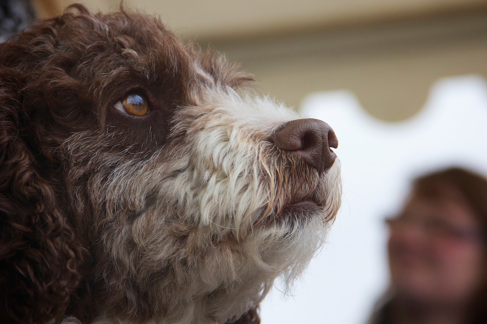
Depth of field can bite you. Most dogs have snouts that make give their faces a lot of depth. The following dog portrait was shot at f7.1.


As you can see, the eyes are sharp, but the nose is blurred. There are five simple ways I could have gotten the whole face into focus:

  • I could have changed the aperture. If I had shot at f11, I probably would have gotten the entire face in focus.
  • I could have changed the focal length of the lens. I was using a zoom lens at 135 mm. If I had shot at 85 mm, I would have gotten a better shot.
  • I could have backed off a bit, increasing the distance between me and the dog.
  • I could have shot the head in profile instead of straight on.
  • I could shoot a dog with a shorter snout. (But less wonderful eyes.)

Here is an example of a dog shot with the same aperture, 7.1, but at a slightly greater distance, and with the head turned a bit:


Dog sharp, dog owner out of focus, just as intended.

Photographers sometimes talk a bit scornfully about "people who shoot everything at f11". The reason why people do shoot at f11, is that it, in many cases, is a good compromise: Good depth of field, and also enough light to allow decent shutter times.


The racing track above is shot at f11. Because there is some distance to the foreground fence, and because of the aperture, the entire racing track is in focus.

To shoot individual cars, you need fast shutter times, and you can get that by sacrificing a bit of depth of field.


The car was shot at 1/1000s. To do that, I had to go to f6.3. Good enough for the car, but you can see that the sign in the background is slightly blurred.

If you are doing macro photography, you will have extremely shallow depths of field. This can be a problem. For example, if you are shooting insects, part of the insect may be unintentionally blurry.

I usually want the largest depth of field I can get when doing macro shots. That means I want to shoot around f22. However, that give me very long exposure times. This is a pain, because even very small air movements can turn small details into blurry messes.

Fortunately, you can get sharp macro shots if you use a flash.

Potted plant shot at f22. For macro photography, I want a wide depth of field. The shutter time is 1/160, but that does not matter much, because I used a flash to freeze movement. Even very small vibrations will cause problems when you are photographing small things. Using a flash will fix the problem, and give you nice, dramatic shadows.
A flash provides enough light to use a reasonable shutter time. Even better: A flash flashes very quickly. This means a flash can act as a super fast shutter, which eliminates the movement-from-air-current problem.

One thing though: You can't use a flash on the camera. You need to get it off the camera, and put it very close to the object you are photographing.

For this kind of photography, you need to work in manual mode, and experiment with aperture and shutter time, until you find combinations that work.

Finally: the only thing that will make you better at using depth of field in creative ways, is practice. Use a guide like this one to get a general idea of how to do what you want, then practice until you manage to do it. I study the metadata of the photos I take, to correlate what I see in the picture with the camera settings I used. You can see the metadata if you have programs like Aperture, Lightroom, The Gimp, or similar.

Monday, 6 May 2013

Squirelks and Treecocks at the Children's Zoo


If you have children, it's the time of year, here in Gothenburg at least, when you start bringing them to the children's zoo. This is one of the few times you may be actually asked to bring your camera, as opposed to the more usual "do you really need to lug around that?"

The answer is obviously yes. I need to bring my camera for the same reason my seven year old son needs to bring his latest LEGO Chima toy. On top of that, I also shoot pictures. I don't really understand the reason for the question...

There is another question that matters though: How do you take interesting pictures at a children's zoo?

Let's list the problems you have to deal with:


  • Competition: Everyone shoots at the zoo. Your pictures will have to compete with those of your friends, aunt Ellen, uncle Harold, your significant other, every other relative you have, perhaps including your own children, if they are old enough to hold a camera.
  • Distance: A zoo is designed to keep humans and animals at some distance from each other, for the protection of both.
  • Angle: Many zoos are designed so that the walking paths are higher than the animals. This makes the animals easier to view. Unfortunately, getting a good shot while pointing your camera downwards at a 45 degree angle is all but impossible.
  • Unflattering light: I don't know who came up with the idea of going to the zoo, or outside, in bright sunlight, but they should apologize. A lot.
  • Uncooperative animals: Most of them will just flat out refuse to do anything interesting while you are standing there. Before you arrive, and after you leave, thats another matter...
  • The people you are with: When you finally find something interesting to shoot, they will start hollering at you to come and view something boring. Or, they will ask you to take an uninteresting picture where they pose for you in harsh sunlight.

Let's deal with these challenges one at a time.

Treecocks are more interesting than peacocks. However, this is not a good photo. Both the foreground and the background have too many distracting elements. The only appealing factor is that the peacock is up a tree.
Competition: You can deal with the competition by taking more interesting pictures than they do. To do this, walk slowly, camera ready to shoot, and look for animals, and people, who do interesting things.

For example, a peacock in a tree is more interesting than a peacock on the ground. That is because you rarely see peacocks climbing trees. At least I don't. For all I know, peacocks in the wild may be the monkeys of the bird kingdom, but I doubt it.

The treecock picture is not a good picture in many other respects: bad lighting, to busy foreground, to busy background...

The fix for that is easy: Get in closer.

According to the famous photographer Robert Capa: "if your pictures aren't good enough, you're not close enough." Capa was a war photographer, but the advice holds at the zoo too. Compare this picture to the previous peacock picture. Which one do you think is the more interesting?
Distance: This peacock picture is a lot more interesting than the treecock. I shot it with an 18-135 mm lens, at a distance of less than 50 cm.

To get a shot like this, you can get a 300 mm lens, or you can pay close attention to what happens on the other side of the fence separating you from the animals. It is very likely that you can find at least a few spots that allow you to come very close to the animals.

Note that I bent down low, and took the shot at the peacock's eye level. It's amazing how many photographers that do not have knee joints. Mine are creaky, but they still work most of the time. When I use them, I get better shots.

Shoot from a low angle. Get as close as you can. Don't be afraid to crop the picture afterwards, to get even closer.
Angle: To get this squirrel shot, I lay down flat on the ground. This gave me dirty clothes and a good angle to shoot from.

From the squirrel's point of view, it made me the most interesting human in view. At one point, I started fiddling with camera settings, and that is when the squirrel decided to have a really close look at me. Unfortunately, my lens wasn't fast enough to follow the little critter when he ran directly towards me, so I missed that shot.

Still, I am pretty happy with the shot I got. I am sure I'll get more opportunities to get a really good squirrel portrait this summer.


An added benefit to getting in close is hiding that you are shooting at a zoo.


Unflattering light: Wedding photographers often use flash in broad daylight to soften shadows. Very bad idea when you are shooting animals. However, there are things you can do mitigate the effects of too strong sunlight:
  • Crop the overexposed parts away. Very often, you have got an overexposed sky, or an overly bright background, that you can crop during post processing.
  • Reduce exposure. You can either underexpose a bit while taking the picture, or do it later in post. It is amazing how much this can improve a picture. For example, the squirrel picture in this article had some blown out areas that I could bring back simply by reducing the exposure setting in Aperture.
  • Increase saturation and vibrancy. This can bring back washed out colors. Go easy on it, unless you want to oversaturate on purpose.
It is amazing how much life you can bring back into a photo by doing these simple things. What is even more amazing, is that few people do.

Don't get me wrong: There are perfectly valid reasons for not fiddling with a photo after you have taken it. But, if you look at it, and see that it has potential, but isn't quite what you would like it to be, you should give it a go.

Even if your post processing goes horribly wrong, and it will at first, you will learn something, and probably have a good laugh in the process.


Uncooperative animals: If the animals absolutely refuse to cooperate, shoot something else. 

If you are alone, you may be able to just wait them out, until they finally do something interesting. If you are in the company of children, friends or family, you probably can't do that. Not for long enough.

Don't get hung up just because you planned to shoot animals, or your children petting animals. If you don't get what you came for, get something else. Focus is a good thing, but do not focus to the point of excluding good opportunities.

Brace yourself, because I am about to show you how not to photograph the people you are with:

This is the kind of shot you will almost certainly be asked to take. It is probably not the shot you want to get, and it is not the shot they will enjoy looking at later. My advice is to take it, and give it your very best. You will have happier company, and more opportunities to get shots they will enjoy viewing later on.

The people you are with: First of all, remember that you went there with other people because you like them. For some reason, often unclear, they like you too, despite your camera.

You do have the option of putting your camera away and just enjoying your time with them. 

You can always come back another time to enjoy the solitary pleasure of zoo photography. Or, if you crave company that is twisted in the same way you are, ask another photographer to come along.

In my case, my son and ex-wife are fairly tolerant, so shooting at the zoo went very well. On the other hand, we played miniature golf afterwards, and then I put my camera away. (I admit it, I tried to play with my camera in hand at first, but it just did not work.)

Be ready to shoot when the moment comes. This takes practice. Because I need to compete with some really good professionals, I practice three times a day, in addition to professional work. The trick to practicing is making it fun. Play around. Then, when the moment comes, you'll be ready. Well, sometimes...
Sooner or later, the people you are with will ask you to take a picture of them. It is unlikely that you will be able to take a good picture. Do it anyway, do it cheerfully, and give it your very best.

If you do that, everyone will relax and be happy. This increases the chances of you getting a better shot, a shot they will enjoy looking at later.