Showing posts with label comic. Show all posts

Monday, 7 February 2022

I'm writing a creative photography book!


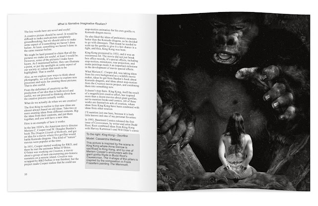
Drawing photography inspiration from King Kong isn't a new idea. William Mortensen did it in the 1930's. I'm revisiting Skull Island with the help of 3D, and the model Cassandra Mellberg.

I'm writing a photography book! It's about creative photography, and it's shaping up to be different from any other book on photography I've seen.

Most photographers learn exclusively from other photographers. I believe that is a mistake. We should learn from each other, yes, but we also need to open up to learning from other sources: realist and imaginative realism painters, comic book artists, 3D artists, movie makers, and writers.

We need to understand our own history, because photography did not begin with the f/64 group, and there is great value in what was before. We even need to go beyond the arts, and learn from other sources, like neuroscience.

I'm striving to tie many different threads together into a coherent whole, and I'm doing my very best to make it entertaining and fun.

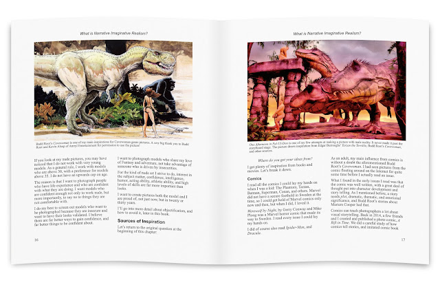
Left page above: I draw a lot of inspiration from comics, so I was more than delighted when Amryl Entertainment gave me permission to use a picture by Budd Root in the book. Budd Root is the author of the comic Cavewoman.

Right page above: I am storyboarding my ideas using 3D software. This allows me to plan my pictures in ways I could not do if I just picked up my camera and shot whatever was in front of my lens. This storyboard, One Afternoon in Pal-Ul-Don, draws inspiration from E.R. Burrough's Tarzan books.


I strive to have something eye-catching, and something useful, on every page spread. From time to time, I will publish a draft page spread, and check the responses to see if I am on the right track.
 various ideas on 
I expect the book project to keep me occupied for about a year. During that time, I also need to do at least a couple of photo sessions, to get material that illustrates various ideas and techniques.

I do hope you will enjoy reading the book as much as I am enjoying writing it!

Saturday, 19 May 2018

Kyla: The Most Dangerous Game


I saw a simple sketch by the comic book artist Frank Cho recently, where he created an amazingly dynamic composition with a (for him) very simple sketch.

It got me thinking about composition, and circular composition in particular.

Frank Frazetta sometimes used circular composition, for example in his Winged Terror. More often, he used very strong triangular composition, as in his Conan picture Chained and in Luana from 1973.

Frazetta was a master at capturing movement. Look at his sketch Pellucidar. Note the similarities to Frank Cho's sketch. (You did click the link, didn't you?). Frazetta uses triangular composition in his sketch, and Cho used circular, but look at the way they have captured the movement!

Stunning!

So, why does my picture use triangle composition instead of circular composition? Because I realized that to make the composition circular, I would need to rotate the body of the guy in the space suit so that his body is more or less perpendicular to the viewer.

I goofed! I should have sketched everything out more carefully beforehand. Instead, I pushed on with the picture, and did not consider the whole until it was too late.

A contributing factor was that I wanted to use portrait format. The ideal format for a circular composition would be a square (I think...I am fully prepared to change my mind once I learn a bit more.)

In the end, I decided triangular composition is good enough for me, right now. Maybe I'll go circular next time...or not.

I used the DAZ Studio default HDRI image set at 0.3 strength for ambient lighting, one spotlight behind the characters to light contours, and a second spotlight straight above. I used spotlights with large surface areas, to get fairly soft shadows.

I brightened the green suit quite a bit in post. The trouble with camouflage spacesuits is that...well, they are camouflaged.

Finally, I painted the whole thing in Dynamic Auto-Painter.

Thursday, 17 May 2018

Kyla: The Hunting of the Snake


The title of this piece, The Hunting of the Snake, is a horribly bad pun. I got the idea from Lewis Carrol's poem The hunting of the Snark.

There are many different interpretations of the poem. Lewis Carrol was once asked if it was an allegory for the search for happiness, and he wrote in a letter that it was.

I have always been fascinated by the last two verses:

 They hunted till darkness came on, but they found
   Not a button, or feather, or mark,
By which they could tell that they stood on the ground
   Where the Baker had met with the Snark.

In the midst of the word he was trying to say,
   In the midst of his laughter and glee,
He had softly and suddenly vanished away—
   For the Snark was a Boojum, you see.

Happiness is a Snark. We hunt for it, but when we catch it, it may well turn out to be a Boojum.

Well, unlike the Baker, at least most of the time, we can survive the Boojum, and live to hunt another Snark. Some of us even find it.

In case you wonder, I made the picture first, and came up with the title, and thus also the interpretation, afterwards.

I suppose, it is a case of cause following effect.

Technically, I created the original picture in Daz Studio.


I used three lights for this picture:
  • The default DAZ HDRI environment, set at 0.3 strength. This gave me a basic low level ambient lighting. The level you can see in the background.
  • A spotlight with 10x10 m area, placed 10 m straight above Kyla and the Constrictor. This gave me a fair amount of light on the trees beyond the large fallen one, and brightened Kyla and the constrictor a bit.
  • A smaller spotlight, 5x5 m, 8 m up, with a more narrow beam of light, focused on Kyla and the constrictor.
The end result is that the further away you get from Kyla and the snake, the darker the picture becomes. Some of my recent pictures have had to flat lighting, and I wanted to fix that.

I painted the picture using Dynamic Auto-Painter.

Here is the first version. I wasn't quite happy with it. I think you can see why:


In this version, the background trees are almost obliterated by the muddy, brown underpaint. I had decided to leave reduce the detail in the background, but the DAP default was a bit too much.

Simple solution: I did a bit of post brushwork in DAP. The reason I mention it, is because if you do the same, do set the opacity of the brush down a bit. The postprocessing brushes have higher default opacity than the same brush used while DAP is autopainting. This can trick you into making postprocessing effects too strong.

Tuesday, 1 May 2018

Kyla: Interrupted Service


I noticed that I was slipping back into my old habit of showing a scene either before, or after, something happens, but not during. So, I decided to break the habit.

My previous Kyla blog post showed her facing off with a giant Deep One, built more like the Abomination than the creatures H.P. Lovecraft describes.

I wrote that I would trim the Deep Ones down a bit, and that is what I did. I kept the bodybuilding one, but all the others are a more normal size. As you can see, I also made sure that particular Deep One won't bother anyone again.

I do have a couple more ideas for a large Deep One though, so he just may reincarnate...eventually.

The title Interrupted Service is a joke. My son would tell me it is a very lame joke, if I asked him about it, so I won't.

If you look to the left, you'll notice a foot and a pair of legs. I won't tell you who it is, but it is the same guy who is in trouble over here. Click the link if you are curious. Some people just won't stay rescued.

I had quite another idea in mind when I started out with this picture, but I got into trouble, and decided to simplify a bit. I haven't given up on the original idea though, so I might do some more work on the same theme.

Saturday, 28 April 2018

Kyla vs. Deep One (Cthulhu Mythos Meets Cavewoman)


One more Kyla picture. Kyla vs. a Deep One. A very, very muscle-bound Deep One. :-)

The interesting thing to me, is that if I can create a passable Deep One, it opens up a whole range of storytelling. The Cthulhu mythos provides rich, and partially copyright free (check very carefully what is free to use, and what is not, if you do anything commercial) material to base stories on, or to weave in as story elements.

I will hold a Photos Inspired by Books event on the 12th of May, in Gothenburg. This picture isn't a photo, of course, but the important thing is the sources of inspiration. In this case:
  • The Cthulhu Mythos created by H.P. Lovecraft, and developed by many different writers.
  • Marvel/DC Comics superhero comics. Yeah, there is a reason for those overdeveloped muscles. Check out Marvels Abomination.
  • The Cavewoman comic by Budd Root. Technically, Cavewoman belongs to the Lost World literary genre, which is a sub-genre of Science-Fiction. By the way, so does Jurassic Park and King Kong.
So, there are three major literary sources of inspiration for this picture. I believe that in order to create something new and interesting, whether it is a picture, or anything else, you need to stoke the fires of your imagination with many different kinds of fuel. Indeed, creativity is the ability to deconstruct those sources, in order to build something new.

There is more of course. I have written before, about how Kyla herself is a result of playing with genre conventions, and flipping gender roles. Kyla fights monsters, she is no damsel in distress. (She has been quite distressing to some people in Facebook art groups though, who prefer more demure, and more fully dressed, women.)

A little bit about the technical side of creating the picture:

The Deep One is a Michael 4 3D mesh with Creature Creator and The Freak morphs. I used the Daz Studio Leather shader for the skin, and changed the skin color.

I rendered with Iray in Daz Studio, tweaked the picture (strategically placed hair and a bit extra brightness and contrast) in Affinity Photo. I worked in 16 bit mode to get a little bit of extra punch in the colors.

Finally, I painted the whole picture in Dynamic Auto-Painter.

Just like there were three different sources of inspiration for the idea, there were three different tools that contributed to creating the actual picture.


Here is the original 3D scene, as I built it in Daz Studio. Whether you prefer the painted version or the original is a matter of taste really. (I doubt anyone who does not like either reads this far.)

While working on this picture, I was actually more concerned with the lighting than the scene itself. The reason? Because this picture is a warmup picture for a slightly more complex picture that I haven't done yet.

Be seeing you!

Friday, 30 March 2018

Lost World IV: Aftermath (a.k.a. Blood on Her Hands)


This is the fourth and final (unless I get more ideas) picture of Kyla.

Yes, I named the character. I thought it appropriate, since she appears in an entire series of pictures, and may appear again.

As you can see, it is immediately after the battle against the T-Rex.

I have written about my sources of ideas for this series in my earlier posts. What I wrote then, goes for this picture too. However, there is one influence worth a particular mention:

Joe Jusko! (Check out his pictures on DeviantArt. It is a treat.)

I have learned a lot just by looking at Joe Jusko's pictures. They are strong, dynamic, the colors are vibrant, the compositions lead the eye to a point-of-interest, but it is more than that. Jusko has something special, Jusko has angles.

No, not angels! Angles! In some of his pictures, he is careful not to overdo it, he uses unusual angles to create drama, and heighten emotion.

I'll link to a couple of his images on DeviantArt. Check them out and you'll see what I mean:

Here are two more. They do not use viewing angle in the same way. I am including them because I like them, and because they have female protagonists that don't take crap from anyone:
  • First oil painting in 1977 (Wow! I didn't know about this one until I researched this blog post. Except for the hair color, the woman could be my character, Kyla.)
  • Stand Off! (If you think the woman looks a lot like La of Opar, it is because she is La of Opar.)
It is very important to know...oh, screw that! I got a new idea for a picture with Kyla. Got to go.

I'll be back!

Friday, 23 September 2016

Repetitions and Variations: Dana vs. a T-Rex

Dana vs. a T-Rex. Model: Petra Brewitz
In a previous blog post, I published Dragonslayer, a quick-and-dirty, but fairly nice looking, picture of a woman facing off with a dragon. I promised to write a bit more about the picture, and how I made it. I also promised to publish a few variations on the theme.

The finished version above, Dana vs. a T-Rex, features Dana, one of the main characters in the A Rift in Time photo comic. Dana was played by Petra Brewitz in the comic, and she also modeled for the pictures in this article.

We did not start out doing a Dana picture. Petra and I had been discussing doing something with a medieval theme. That takes a lot of preparation, and quite a few props, so we decided to make something simpler, just to try things out.

Technical details: The picture above was created by applying the Painted 2 + Border filter in Comic Life 3. This filter creates a painted comic book look that works very well for many illustrations.

The original inspiration for my picture came from an illustration by the Fantasy artist Joe Jusko

If you compare Jusko's image with mine, you will see that there are a lot of differences: Mine is, how shall I put it, more modest, his is in portrait format, mine is in landscape format, his has a medieval fantasy setting while mine is urban Science-Fiction, and so on...

My picture started out being more like Jusko's. I planned to use a dragon, and I planned to shoot vertical. As I worked through several iterations, my picture diverged more and more from Jusko's. A good thing, because those differences are what separates being inspired by, from plain old copying.

Let's look at how I built the basic composition. The picture above is built from three photos.


I photographed Petra in a parking lot. She, Julia Reinhardt, and I took a photo walk after a planning meeting (I'll tell you about it in a future blog post), and since I just happened to have a toy gun in my backpack, we took the opportunity to shoot the picture when we found a fairly clean background.

I used a single hotshoe flash placed under my camera to light Petra and eliminate unwanted shadows.


I shot several photos of Petra, with both portrait and landscape orientation, and with different lighting.

The reason I switched from portrait to landscape is that it allowed Petra to take a wider stance. A wider stance leaves more space to show the monster.


I shot the background after shooting Petra. This is usually a bad idea, because it is difficult to get the angles right.

In this case, I had measured the distance between the ground and the camera when I shot Petra (1 hotshoe flash height + 3 fingers), so it was easy to replicate the angle.

I used a 35 mm lens, and f/14. I wanted to keep everything in the picture, from Petra to the portal, reasonably sharp.

The woman sitting on the bench? I cloned her out. Quite easy to do.

Oh, perhaps I should mention: Originally, I intended to use a different, more dragon friendly environment, and something much more like Joe Jusko's original.


I had shots from a pond that I had shot for another different picture. (You may remember the brachiosaur picture I published awhile back.) I thought I would be able to use one of them.

As it turned out, all of them were shot with the camera too far from the ground. I could have gone back to the pond to reshoot, but a combination of impatience and laziness made me change my mind. Instead, I shot something close at hand, which turned out to be the brick building.


Oh, the dragon... The wings look fairly good, but the rest... I just had to try anyway.

Sometimes you got to try, even though you know it won't work.

As you can see, the dragon is truly awful. The only part that works reasonably well, is the tip of the wing in the window to the left of Petra.

How do you save a picture like this? I could put in a lot of effort in an attempt to make the dragon look more organic. An easier way is to reduce detail in the entire picture. that way, the viewers expectations change, and something can suddenly be perceived as better.

Dragonslayer
I added a quick and dirty paint effect with Prisma's Mononoke filter. The filter removes a lot of details, and hides what is wrong with the dragon.

I wasn't happy though. I wanted something a bit more realistic. There was a model I had wanted to try out for awhile, a snake, made by the Schleich toy manufacturer.


The snake version looked quite good. Technically, it is the best version of them all. I did sharpen the teeth a bit in post, and I ought to have replaced, or fixed, the tongue. Nevertheless, the picture works, except for one thing!

The story! What is the story? Why is there a giant snake in something that looks like a factory? (The dragon had the same problem, but the model was so ugly I never had to worry about the story.)
In this version, the protagonist is aware it is weird that a giant snake appears in a doorway. She expected a T-Rex, so there is a bit of a twist left for the viewer to wrap herself around.
Here is a useful storytelling trick:

When there is a completely illogical gap in your story, make your protagonist aware of it!

In the version above, the protagonist didn't expect to be face-to-face with a giant snake. She expected a T-Rex, so the viewer may still not quite get what is going on, which is intentional.

Viewers familiar with A Rift in Time will be in on the secret: It's a time-travelling T-Rex! They might also guess that the person facing off with the T-Rex is an RRC operative, and they might even recognize Dana.


Just in case you were wondering, this is what the Schleich snake model looks like. It is less than five centimeters high (about two inches).

Once I got this far, it was natural to simplify the story a bit. What would it look like if Dana encounters the T-Rex she expected?

Dana vs. T-Rex, photo version
In the version above, the T-Rex looks pretty good, but it is not photo realistic. I have solved that problem before, by adding organic textures, but I decided to go the easier route, and make a comic panel.

The T-Rex
The final version
And here we are again, with the final version...or maybe not. There are still plenty of variations I could explore.


Sunday, 10 July 2016

Big!


 Big! is my latest composite. I've had this image in my head for quite some time.

I created the composite in Pixelmator, and toned it with the Vintage Iris effect.


While I was at it, I made a comic version using the Paintoscope filter in Comic Life 3. I like the Paintoscope filter a lot, and am considering using it for a comic project.

I made the composite from three different photos.


The elephants feet are from a photo I took in the Museum of Natural History in Gothenburg.

When I took this shot, I had the finished picture in mind. I did not know exactly what it would look like, but the general idea was clear.

I did a bit of cut and paste to take the foreground and extend it into a background plain.


 The man and the shadow, well, that is a shot I took for another composite some time ago.

It is a selfie. I put my camera in a tree, and used the 10 second timer to delay the shot.

Unfortunately, part of my shadow is blocked from view by a car, so I did a little bit of repair work on the shadow for the final picture.


The third photo is an old environmental shot I took ages ago. I used the mountains and the bleached out sky.


Sunday, 19 June 2016

Something wicked - Comic pre-production agony

Horror from Above – Petra Brewitz looks up, and something wicked looks back.
When I wrote the manuscript to A Rift in Time, the time-travel action adventure comic, I planted a few seeds for new stories.

Petra Brewitz, Petri Olderhvit, Julia Reinhart and I have started kicking ideas around for a sequel. That means we are in the oh so agonizing pre-production stage, the pre-idea stage really, when we try to come up with new ideas, and connect them to each other, and with some old ideas, without making a total mess of it.

Comic version of Horror from Above. We want a look similar to the first Rift adventure, but with a slightly more realistic look.

A project like this starts out pretty messy, and that is perfectly okay. Actually, it is a prerequisite for making something really good. The trick is to have the right kind of mess, and to narrow it down to a logical structure in the end.

Something Wicked.
What you will see in the final comic may, or may not, resemble what you see in these prestudy sketches.

When we will be done? I have no idea. We are doing this for fun, in our spare time, so it will have to take a back seat to just about anything that pays the bills.

In addition, we are deliberately planning to make things difficult for us again, setting goals way beyond what is reasonable. Creates headaches, but also makes for a wonderful learning experience.


Tuesday, 10 November 2015

Savage Heroes: Warzone! – How to Create a Superhero Picture


Recently, I did something I have wanted to do for a very long time: I created a full-scale superhero team slugfest picture!

The idea was to create a picture that could work as the centerfold in a Marvel or DC Comics superhero comic book adventure from the 80´s or 90´s: A messy, complicated fight, strong colors, and  heroes and villains that really let loose with their powers.

I wasn't alone. We were 12 people who worked together to create the picture. Here, in comic book format of course, is how we did it.


Friday, 21 August 2015

A Rift in Time: An Adventure They Never Saw Coming


A Rift in Time is done! After more than a year living with this comic project, it feels fantastic to see it published. The comic is now on sale as an ebook on Swedish ebook stores: Adlibris, Bokus, Bokon, and Publit. We are working on getting A Rift in Time to international stores.

A little more than a year ago, I pitched a new project in a photography network organisation, Fototräff i Göteborg (Photo meetup in Gothenburg).

This is the pitch I made in Fototräff, the photo meetup network.
I had started the Fototräff network in 2013, to build up an organisation of both amateur and pro photographers, models, makeup artists, videographers, writers, and other people, with an interest in photography and media production.

We had been doing a lot of interesting stuff, but most of it was small scale: photo experiments, and model photo sessions. I thought we were ready to do something more ambitious, so I published the pitch in the picture above, in the Fototräff group on Facebook.

Five people were interested: Petri Olderhvit, Julia Reinhart, Petra Brewitz, Robert Johannesson, and Jesper Andersson. Two more people, Lennart Guldbrandsson and Marie Eriksson joined the team shortly thereafter.

Creating a comic is challenging, and we did not pick the easiest way to do it. Most of us on the team are photographers, and we decided early on to do it like I had done in the pitch, as a photo comic, but with the look and feel of a drawn comic.


I wrote the first version of the script using Comic Life, a comic book layout application. Then the entire team contributed to improving it, and finding ways to solve, or work around problems, both story related, and technical.
Panels from pages 1, 8, and 10 of the A Rift in Time comic.
The inspiration for the visual style comes from many different places, but the most important was 80's style superhero comics by Marvel. At the time, Marvel artists relied heavily on exaggerated perspectives to create drama. We decided to do the same, but photographically, rather than by drawing.

This meant we worked a lot with short lenses, in the 10-30 mm range, for key, dramatic comic panels.

The team spent a lot of time lugging photo equipment around in parks in, and near, Gothenburg.
The team did a fantastic job! We worked for a year, and took more than 2,000 photos, to create the comic. The story went through several revisions. We learned new digital compositing techniques, honed our photography skills, and figured out how to do stunts that looked lethally dangerous, but were actually quite safe.

Just creating the comic wasn't enough. We knew we had a good thing, a cool story that lots of people besides us would enjoy reading, so we started to figure out how to market A rift in Time. It had to be a guerilla marketing campaign: low cost, but a lot of bang for our bucks.

We started by exhibiting pictures from the comic at Planket, the largest photo exhibition in Gothenburg. We had timed it so A Rift in time would go on sale right before the exhibition.

The A Rift in Time exhibition at Planket drew a lot of attention.
The exhibition was a success: People liked our comic! So, we went ahead with our plans.

One of those plans were to start up a web store at Zazzle, for people who want to buy t-shirts, mugs, phone cases, and other products with motifs from the comic. There is more, lots more, but we'll keep that under wraps, until we are ready to deliver.

The work we did could fill a book all by itself, and that is exactly what we aim to do. In parallell with developing new projects, we are also going to document why, and how, we did A Rift in Time, in a book of its own.

I hope you have as much fun reading A Rift in Time as we had creating it.

Friday, 14 August 2015

A Rift in Time is released!

The A Rift in Time photo comic has been released. It is available on several Swedish online stores, including Publit, Adlibris, and Apple iBooks.

A Rift in Time will also be available on international stores, like Amazon, and Lulu very soon.

We are also releasing a line of A Rift in Time products: T-shirts, mugs, and more, at the new A Rift in Time online store.

Thursday, 4 September 2014

Victorious: How to turn toys terrifying with Pixelmator


I played with my son yesterday, and this gave me inspiration for an impromptu photo session. I recently hosted a Low Key photography themed Photo & Coffee meeting for people in my photography network, Fototräff i Göteborg (Photography meetup in Gothenburg). Low Key photography was still on my mind.

To take the shot above, used a DSLR and one remote controlled flash. The shot was taken in a living room. I did the following:

  1. Set the camera on manual, and the ISO to the lowest possible setting.
  2. Set the flash to manual, and reduced the strength to its minimum setting.
  3. I put a speed grid on the flash to eliminate light spill. You can use a snoot, or an empty Pringles tube.
  4. I put the action figure on the edge of a table.
  5. I took the shot with the flash above the figure, and angled downwards. The camera was angled slightly up. This creates dramatic shadows, and makes the figure look quite large.
At this point, the photo looked like this:

Fairly good for an improvised shot of a toy, but the look is too shiny and plastic.

Enter Pixelmator, my favorite image editor.

At first, I thought I'd just do a quickie, and add some rain, so I created a new black layer and used Pixelmator's rain generator. I then selected the rain, created a mask that left only the raindrops visible, and changed the blend mode to screen.

I wasn't happy with Venom's tongue. In the original photo it looks very plastic, and I wanted a more organic look. I decided to add some texture by using an old photo of catfish skin. (Yes, I got stuff like that lying around from other projects.)

The catfish skin looked pretty good on the tongue, but even better on the armor, so I decided to keep it. I used a mask to erase it from the Iron Man helmet though.

Next, I selected all the brightest parts of the image, copied them to a new layer, added a tiny bit of Gaussian Blur, did something I don't quite remember (sorry about that), and changed the blend mode to Luminosity. This turned the highlights into gaping black holes. Perfect battle damage.

I used a soft brush with about 10-20% opacity to touch up the picture, mostly by painting on the various masks to hide or display parts of the original photo.

I created a layer for the blood, selected a deep red color, and used two spatter brushes from Pixelmator's Abstract brush set to paint blood around the gashes on the helmet and armor. I changed the blood layer blend mode to Darken. The best blend mode to use for blood can be different on different photos.

The blood looked a bit thin on the helmet, so I copied the blood layer, and erased all blood except the blood on the helmet on the copy. That gave me a bit stronger coloring on the helmet.

The armor looked a bit dry, so I copied it to a new layer, changed the blend mode to Overlay, and reduced the opacity to about 56%.

That gave me a pretty cool look.

Best of all, my son liked it!