Showing posts with label creativity. Show all posts

Monday, 7 February 2022

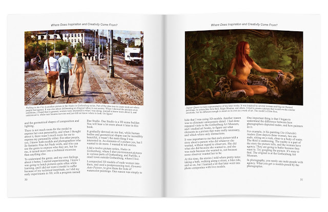
I'm writing a creative photography book!


Drawing photography inspiration from King Kong isn't a new idea. William Mortensen did it in the 1930's. I'm revisiting Skull Island with the help of 3D, and the model Cassandra Mellberg.

I'm writing a photography book! It's about creative photography, and it's shaping up to be different from any other book on photography I've seen.

Most photographers learn exclusively from other photographers. I believe that is a mistake. We should learn from each other, yes, but we also need to open up to learning from other sources: realist and imaginative realism painters, comic book artists, 3D artists, movie makers, and writers.

We need to understand our own history, because photography did not begin with the f/64 group, and there is great value in what was before. We even need to go beyond the arts, and learn from other sources, like neuroscience.

I'm striving to tie many different threads together into a coherent whole, and I'm doing my very best to make it entertaining and fun.

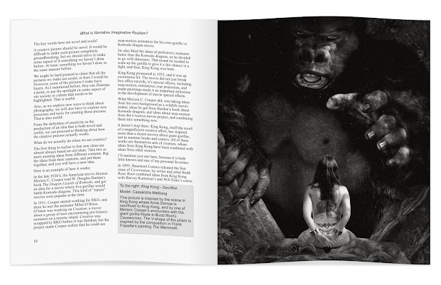
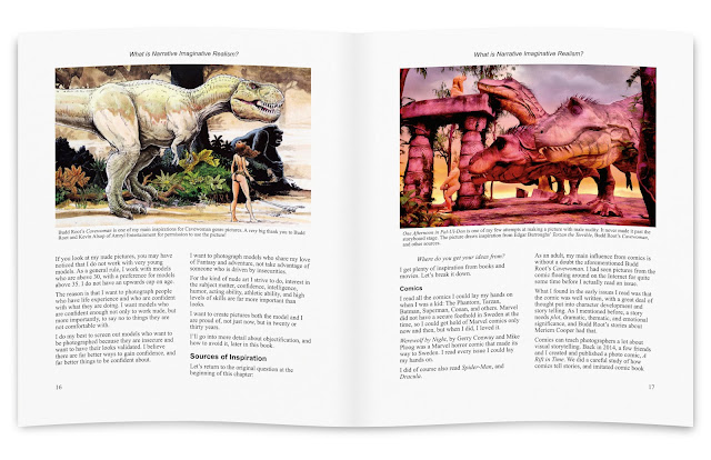
Left page above: I draw a lot of inspiration from comics, so I was more than delighted when Amryl Entertainment gave me permission to use a picture by Budd Root in the book. Budd Root is the author of the comic Cavewoman.

Right page above: I am storyboarding my ideas using 3D software. This allows me to plan my pictures in ways I could not do if I just picked up my camera and shot whatever was in front of my lens. This storyboard, One Afternoon in Pal-Ul-Don, draws inspiration from E.R. Burrough's Tarzan books.


I strive to have something eye-catching, and something useful, on every page spread. From time to time, I will publish a draft page spread, and check the responses to see if I am on the right track.
 various ideas on 
I expect the book project to keep me occupied for about a year. During that time, I also need to do at least a couple of photo sessions, to get material that illustrates various ideas and techniques.

I do hope you will enjoy reading the book as much as I am enjoying writing it!

Saturday, 29 May 2021

Learning from Julie Bell and Jamie Chase


Thanks to Julie Bell and Jamie Chase, both great Fantasy artists, I can show you how to draw inspiration from masters, to improve your own creativity and skill.

Both Julie Bell and Jamie chase publish their art on Facebook. 

Julie Bell: https://www.facebook.com/julie.bell.589 
Jamie Chase: https://www.facebook.com/jamiechasearts

---

Getting Covid-19 in the beginning of April hit me pretty hard. I am recovering though, and I am starting to take interest in things again: Starting a new job on Monday, working on a picture or two, occasionally working on a book, working on getting my photo sessions going again... I am still a bit careful where and when I spend energy though. I expect to recover fully, but it may take quite some time.

The upshot is that I'll probably blog a bit less frequently than usual. In a few months, maybe, I'll pick up speed again.

Fortunately for me, while being sick, and throughout recovery, I've had great support from my family. It has made everything so much easier. Speaking from experience, you really do not want to get Covid-19, and you really, really, do not want to infect relatives and friends, so please be careful out there.

Sunday, 23 August 2020

Shooting Horrors from the Beyond with Eliza Sica, Part 1


When the Sleeper Awakes (a.k.a. The Frozen)

Eliza Sica (Instagram: @eriizas) is an actress and model I had contact with before the pandemic. Recently, we decided to have a carefully socially distanced photo session.

I maintain a catalog of my storyboards in PDF format. I sent it to Eliza, and we set up a meeting at a café in Gothenburg. (Again - a carefully socially distanced meeting.) We went through the storyboards, Eliza selected the ones she was interested in shooting, and we discussed what preparations we needed, and how to do the shoot itself.

We also discussed our contract. Even for a non-commercial shoot, a contract, although painfully boring, is important. Due to the General Data Protection Regulation (GDPR), it is a legal requirement in the EU. Beyond that, a contract makes clear the rights and responsibilities of both model and photographer.

I am slowly gathering material for a book about creative photography, and a contract is important for that reason too. When I send my book manuscript to a publisher, I want to be able to show the contracts too.

 The shoot itself went well, despite a mistake on my side: I hadn't made a shot list! This created extra work, because it meant we had to move the studio flashes much more often than we would otherwise have had to do. Eliza was patient though, so it worked. Next time, a shot list will be a priority on my part.

I got the idea for When the Sleeper Awakes from two different stories, both by by H.G. Wells: The Sleeper Awakes and The Time Machine:
What if a group of people are cryogenically frozen, and forgotten forgotten for many millenia when our civilization collapses. Eventually, the cryotubes begin to fail, and only one remains, when it is discovered by Morlocks...
There is one more source of inspiration: I re-read Morlock Night by K.W Jeter some time ago, and that that inspired me to work on a set of Steampunk Time Travel pictures. That got me thinking about H.G. Wells and his stories, and that eventually lead to When the Sleeper Awakes.

You might wonder where I got hold of an old run-down cryogenic facility, a Morlock, and a couple of desiccated skeletons.

I built the environment using commercially available 3D models. I did quite a bit of customization, adding rust, fungi, and molds.

I created the Morlock by mixing commercially available morphs of a Genesis 8 base character. As for the desiccated bodies...it is probably best you don't know.

Creating the Eliza's frozen look was fun. I studied videos on how to create a frozen look, but in the end, I discarded those methods and went my own way:

I rendered the door of the cryotube separately from everything else, because I wanted to build layers of frost on the body and on the door separately. First I matched luminosity and color tones of Eliza and the cryogenic tube. Then I desaturated Sica's skin, and added several layers of frost to skin and hair. After that, I added frost to the cryogenic tube door in the same manner.

For pictures like these, I often use Dynamic Auto-Painter to create a very colorful digital painting version, which I then blend in with the original picture. That gave the picture its final, very strong colors.

The Horror in the Library

The Horror in the Library is of course inspired by H.P. Lovecrafts Cthulhu mythos. Again, both the thing lurking in the shadows and the library are commercial 3D models.

The main thing to get right here, was the light on the monster. I wanted to show that it was definitely not human, but I also wanted to hide the face. What we do not see can be more frightening than what we do see.

There are many more pictures coming up the next few weeks, and perhaps months, given how slow I am when editing.

Long medium to long range plans for the pictures include the book I mentioned, and also exhibitions. For now though, I'll focus on editing the other pictures from the photo session.

Be seeing you!

Tuesday, 23 July 2019

King Kong VIII: Protector, or How to Create a Dirty Picture

King Kong VIII: Protector is a storyboard for a future photo session. Creating storyboards allows me to catch and correct errors, and to communicate ideas with models and other people who help me create the pictures.
As you know, I draw inspiration from many different sources when I plan and create pictures. The picture above is a good example:

The basic idea and composition is from the 2005 version of King Kong. As discussed in earlier King Kong/Skull Island posts, I am taking a look at what the island might have been before Kong, during the 3,000 years humans and gorillas have lived on the island.

I do have a tendency to trip over my own love of the movies though, and recreate scenes from them, rather than using them to jump start my imagination.

Why an albino gorilla? Well, it could have been because I watched Rampage a little over a week ago, but it wasn't. The real reason was contrast. In the King Kong movie, Ann Darrow is blond, and wears clothes that are mostly bright in color. That means she shows up in bright contrast to Kong, when she stands in front of him.

My protagonist in the storyboard is much darker, and would be almost invisible against a dark background. Something had to change, and I chose to change the color of the gorilla.

Another difference is that the character in my picture is armed, and prepared to fight back. This suggests a slightly different relationship with the gorilla than the one Anne Darrow had with Kong. More of a cooperative partnership, where they help each other survive.

Getting Dirty!

There is one important thing i got from Rampage: Dirt! If you look closely at a picture of George, the giant albino gorilla in Rampage, the fur is matted an full of dirt, little twigs, and generally icky stuff that can get caught in long gorilla fur.

The gorilla model I used is excellent, but it is also squeaky clean, so I dirtied it up quite a bit. for the gorilla, I created a layer for the dirt, and then used a couple of different texture brushes to paint the dirt in. I changed the blend mode to Soft Light and reduced the opacity to 50%, to make the dirt blend in with the fur. I then created a second dirt layer and repeated the process.

Speaking of dirt, 3D images tend to have a look that is way to clean to look realistic. I tried to fix the overall look by taking the picture rendered in Daz Studio, repaint it in Dynamic Auto-Painter PRO 6, and then use the painted version as a Soft Light overlay. This dirtied up the trees and the ground a little bit, while also adding a smudge of dirt here and there to all three characters in the picture.

Growing Grass

I used only a few trees for the background, but I created many instances, to make them look like a whole forest. You can create instances manually in Daz Studio, but I had great help from Scatter Pro. Scatter Pro made it easy to create lots of trees, distribute them over and area, with random variation in placement, size, and rotation.

I did the same thing with the larger tufts of grass, but the ground still looked too flat and sterile. To combat that, I added a grass mesh. When that still did not help, I painted in some extra grass in post.

Frankly, the ground still looks to flat and sterile. I am considering reworking it in two ways:

The first is to simply use a photo of a meadow. That would give me the most realistic results, but it will be a challenge to mask the gras, so I can put objects behind it.

The second solution is to experiment with the new hair system in Daz Studio 4.11, to see if I can use that to create reasonably realistic grass.

There is a third option: Blender 2.80. However, Blender will probably take me about a year to learn, and only if I put in a lot of effort, so if I go that route, there won't be any quick results.

The Original

For the purpose of comparison, here is the original render, straight out of Daz Studio.


The Daz render had a transparent background. I used an old photo of a forest to provide background for the image. Note how much cleaner this picture looks than the finished version. Way too clean.

In addition to the changes already mentioned, I increased the contrast, reduced the saturation, and changed the color temperature to make the light a bit more like evening sunlight.

I also cropped the picture from a 2:3 to a 1:1.85 aspect ratio, partly to get rid of unnecessary foreground, and partly to give the picture more of a movie look.

Getting It Right the Last Time

I almost never create a great picture on my first try, and if I do, it has as much to do with luck as with skill.

It is very difficult to correct your mistakes unless you see them, and you won't see them until you have created a picture. Thus, the first version of a picture is usually not very good in and of itself, but it is an excellent aid to creating a better picture.

Painters often recreate the same basic picture over and over again, continuously changing and improving it as they go. Sometimes there are big changes, sometimes just minor tweaks, but the willingness to iterate is the key to improving.

I am, I must confess, a bit lax in this regard. I tend to get new ideas faster than I can create storyboards for them, and much faster than I can organize photo sessions. The result is a certain sloppiness, that ultimately can hold me back from developing as a photographer and as an artist. I tend to be too happy when I express an idea, to worry about details.

This is a weakness, and this time, I'll try to fix it. I'll make a new version of this picture correcting the things I am not happy with, just like a painter would do. There are plenty of things that can be improved, but there is one thing in particular that I find annoying about this version?

Can you guess what it is? If so, comment!

The first version may not be perfect, but I am determined to get it right the last time.

See you!


Friday, 20 July 2018

Pictorialism vs. Neo-Pictorialism vs. Contemporary Pictorialism

Bareback Riders - Pictorialist Version
In this article I will use the same basic photo to create three very different pictures, a pictorialist version, a neo-pictorialist version, and, for want of a better term, a contemporary pictorialist version.

Hang on! You are in for a ride!

The slow bit: A brief history of pictorialism

 Pictorialism is a photographic style that was popular from 1885 to about 1920. The style all but disappeared for a long time, but it was rediscovered in the 90's.

The rising interest in the original pictorialists and their pictures, also kindled an interest in recreating their style. Behold, neo-pictorialism was born!

Neo-pictorialist pictures are stylistically very similar to pictorialist pictures, but there are important differences. If there weren't, this article would end here.

What about contemporary pictorialism? First of all, I invented the term. There are people today, who do what the pictorialists did a hundred years ago. Because there is a 100 year gulf separating the original pictorialists from the contemporary ones, the technology has changed, our society, and social norms, have changed. Therefore, a contemporary pictorialist picture can look very different from a pictorialist picture from 1918.

Enough with the history lession! Let's get on with creating the pictures!

The boring base photograph

Base Photo: Bushes and Borgholm Castle
The base photograph is a picture of some boring shrubs. You can see the Borgholm Castle in the background, but as castle photos go, this one is pretty much a dud. The castle is very interesting, but you cannot see that in this picture.

Let's take this unremarkable photo, and have some fun with it!

Neo-pictorialist version

Bareback Riders: Neo-Pictorialist Version. Note the absence of horses and riders.
Let's begin by giving the picture the neo-pictorialist treatment. When people talk about creating pictorialist pictures today, they usually mean neo-pictorialist pictures.

Neo-pictorialism is mostly a technical exercise. The objective is to make a picture stylistically similar to an old pictorialist picture. The closer you get, the more you have succeeded.

Pictorialists in the early 20th century wanted to evoke emotion. They wanted to create art. To do that, they turned to painters for inspiration. Consequently, they often wanted their pictures to look like paintings.

To create painterly effects, the pictorialists used a great variety of tricks. Anything that worked was okay to use. They often blurred their pictures, they hand-colored them, dodged, burned, used early composition techniques...

Neo-pictorialists recreate the look of the pictorialist photos, much like historical reenactment societies recreate old battles.

Thus, if we take our base photo, and make it look stylistically like a pictorialist photo, then we have a neo-pictorialist photo.

Why are there no horse and riders in our neo-pictorialist version of the photo? Because there is no reason to have them there. Only the style is important. The content does not matter, as long as it does not look too modern. Consequently, neo-pictorialist pictures are often pictures of nature, landscapes, forests. A really old car is okay to shoot, but a modern car is not. To some neo-pictorialists, shooting with old lenses and using the original processes is a matter of pride.

Pictorialist version

Bareback Riders: Pictorialist Version
In the pictorialist (1920) version of the photo, the style is exactly the same as in the neo-pictorialist version, but the content is different. Why?

Because, to a pictorialist, content was important. Pictorialists asked questions like:

Is it beautiful?
Is it scary?
Does it tell a story?
Does it convey an idea?
...and so on

A pictorialist uses whatever means available to further the purpose of the picture. It is that simple.

They did not care about using the "correct" process, or whether the picture conformed to genre conventions. They used whatever means they had. The style is as much a result of technical limitations, as of aesthetic considerations.

For this picture, I have stuck with the convention of making the photo look like a painting, but the technique I use for doing so is completely modern. In case you are curious, I used Dynamic Auto-Painter, a tool that analyses the photo, and with a little guidance from me, recreates it from scratch, as a painting.

Making their pictures look like paintings was a means to an end, not an end in itself. It was a convenient way to help viewers relate to the photos by relating the photos to something the audience already knew. (A bit like when the iPhone was introduced. The iPhone is a miniature mobile multi-purpose device. Most of the time it is used, it is used as something other than a phone. Calling it a phone made it easier for people to relate to it.)

Nudes are common in pictorialism because the nude human form evokes feelings. Most pictures are of nude women, because most of the photographers were male. There are exceptions though. There were female photographers, and photos of nude males.

Note the difference between pictorialist and neo-pictorialist:
  • The pictorialist uses cutting edge technology and processes to express emotion and ideas.
  • The neo-pictorialist tries to emulate the results of processes used by pictorialists in the period 1885-1920.
What would a pictorialists do today? I am glad you asked.

Contemporary Pictorialism

Bareback Riders: Contemporary Pictorialism
A contemporary pictorialist would ask the same, or similar, questions that a pictorialist would:

Is it beautiful?
Is it scary?
Does it tell a story?
Does it convey an idea?
Do I have to ask exactly the same questions a pictorialist would have asked 100 years ago? (Hint: The answer is NO!)


If you have read my blog posts about the Gothenburg Nudes series, you know that the basic idea was to separate nudity and objectification, for the purpose of making room for appreciation.

This basic idea guided the design of each picture, and of the series as a whole. The Öland Nudes series uses the same basic idea, but it is tailored for a slightly different audience.

People tend to relate to places they know, so I use familiar locations to trigger interest, before I hit t
hem with abstract concepts.

I admit, it does not work perfectly. Some people see nipples, and after that, they see nothing else. This happens both with those who like nipples, and those who don't. Neither group is my target audience.

My target audience is the group of people who appreciates both the beauty of the human form, and abstract reasoning...and especially those who either live in Gothenburg or on Öland.

If you live elsewhere, please do not feel left out. You can appreciate Gothenburg and Öland even if you do not live there.

That is the difference between pictorialism, neo-pictorialism, and contemporary pictorialism as I see it. Feel free to disagree. If you do, please also feel free to comment. I am interested in your opinion, whether your argument changes my mind or not.
Wednesday, 25 April 2018

An Afternoon in Pal-Ul-Don (Aspect Ratios, Stephen Spielberg, and Facebook Click Optimization)


Pal-Ul-Don is a Lost World from Tarzan the Terrible a novel by Edgar Rice Burroughs. This scene is not from the book, but loosely inspired by it.

My pictures are inspired by what I read, the movies I see, comics, conversations I have with other people, and of course my own experiences.

Technically, a picture like this is much easier to create than you think. I am a photographer (well, when I am not a systems thinker that help organizations improve their processes and their organizations). When I create a picture like this, I think like a photographer, and to a large extent, work like a photographer.

For example, you may have noticed that this picture has a slightly different aspect ratio from what you are used to. That is because it is 1.85:1, which happens to be the aspect ratio Steven Spielberg chose for Jurassic Park.

Why did he do that? Movies are usually shot in a 2.4:1 aspect ratio, making the pictures very wide. his is great for a lot of things, but it gets cramped for a dinosaur that is very high.

The picture above compares the 1:85 aspect ratio Stephen Spielberg chose for Jurassic Park with the 2:3 ratio common in photography, and the 2.4:1 ratio of most movies.

If you want a T-Rex to look good, go with 1:85!

...except, of course, when something else works better. The Jurassic Park movies have been shot in a variety of different aspect ratios. Jurassic World was shot in a non-standard aspect ratio, 2:1.

If you are working in 3D, don't forget that you may need to adjust the focal length of your camera to get good results. Daz Studio uses 65mm lenses by default. For An Afternoon in Pal-Ul-Don I used a 50mm lens. Jurassic World used mostly 30mm and 60mm.

A bit of trial and error works wonders here. I decided what I wanted in frame first, then set the aspect ratio, and adjusted focal length and camera position until I was happy.

Speaking of happy...


If you value likes on Facebook more than you value creating a good picture, you might want to use the photography portrait aspect ratio, 3:2.

Because Facebook uses a narrow column for posts, using portrait format maximizes screen space.

To really see and experience the impact of a landscape format picture on Facebook, it is necessary to enlarge it by clicking on on it. Most people won't do that, even if you have created a great picture.

Instead, to maximize likes, you will either have to butcher your image and crop it down to portrait format, or design your picture for portrait format from the start.

With 3D, you can create a set of cameras using different aspect ratios, and use them to create different versions of the same scene.

Me, I am bull-headed and tend to go with the aspect ratio I like best on a picture by picture basis, even if it means the pictures won't get as popular on Facebook.

Saturday, 7 April 2018

The Tunnel

I started working on The Tunnel about a year ago. The photo is a selfie I shot in a tunnel under a railroad a couple of kilometers from where I live.

I set my camera up on a tripod, took a remote triggered hotshoe flash in my hand, set the camera timer for 10 seconds, and ran like crazy to get into the right position in time.

It took several tries, but finally I had a shot that was good enough.

I wnt to a fish store and shot octopus tentacles. However, that did not work out as I had hoped. Dead octopi don't pose well.

After several tries, I finally put the picture aside. I realized I would have to try something else.

Awhile ago, I started using Daz Studio to compose 3D scenes. That got me thinking about using a 3D model of an octopus to create the picture you see. A couple of days ago I gave it a try.


With Daz, it was relatively easy to position the tentacles.


What you see here are the rendered tentacles, right out of Daz Studio.


I composited, added shadows, and relit the picture in Affinity Photo.

At this point, I had a so-so photo composite. It did not quite work as a photo, because the tentacles looked a bit artificial to start with. Also, the photo was a bit too clean. I wanted a dirtier tunnel.

Filters in Affinity Photo, Photoshop, and most other tools, do a mathematical transformation of the image. In many situations, that is exactly what you want.

However, I wanted a more painterly feel. At this point, I had two ways to go:
  • Use the Paint Mixer tool in Affinity Photo to paint the whole picture manually. That works very well, but it is also very time consuming.
  • Use Dynamic Auto-Painter to paint automatically, with manual input only where necessary. Much faster, nearly as fun, and arguably, better results. (Depending on how good an artist you are.)
I went with Dynamic Auto-Painter, and created the picture at the start of this blog post.


I also created a couple of variations. The very dark one you see here is actually closer to what I had in mind originally.

My son thinks this is the best version because "what you cannot see is scarier than what you can see."

He's got a very good point.

Because the picture is so dark, it can appear almost completely black on some monitors though.


I created an in-between version, darker than the first, but brighter than the second.

Which version you prefer, is of course up to you.

You can find these pictures, and a portfolio I am building, at ArtStation.

Monday, 19 March 2018

Lost World I: Dangerous Shadow


I have had the idea for this one in my head a couple of days. The idea is that sometimes, you have to knowingly walk into danger, and take on something that may be too big for you to handle.

This is one picture that I'd like to make a photographic version of. We'll see how that works out.

Where do you get inspiration for a picture like this? Well, I got it from several different sources. The Lost World theme is from books like Arthur Conan Doyle's book The Lost World, and Michael Crichton's Jurassic Park. Edgar R. Burrough's Tarzan and John Carter books are also strong influences.

In case you are wondering about the nudity: It's the norm on Barsoom, where John Carter had his adventures. Also, I budget my 3D projects carefully, and appropriate clothes weren't in the 3D budget for this month, and because I am still trying to figure out how to do nude art.

There are of course artists that have inspired too. The somewhat exaggerated proportions of the woman is inspired by the art of Boris Vallejo, Julie Bell, and Frank Frazetta. The situation, with impending danger, owes more to Joe Jusko, and perhaps FrankCho. (Frank Cho would probably have turned the idea into slapstick comedy.)

Technically, I am a photographer, not a painter, so I take a photographer's approach to creating pictures. That is, I do not create stuff. I take existing stuff, and arrange it on a scene in front of a camera, and take a picture. It just so happens, this time I used 3D objects. and the scene was created in Daz Studio.

Oh, I did a bit of post processing in Affinity Studio and Dynamic Auto-Painter. Dynamic Auto-Painter is quickly becoming a favorite of mine.

I do have a couple of more ideas on the same theme, so this may well turn into a short series of pictures.

Wednesday, 31 January 2018

Social Media Bubbles

If you think you do not live inside the Matrix, it is because you are asleep inside your bubble.

We all live inside information bubbles shaped by the algorithms that choose what information to give us on social media.

Facebook, Youtube, Google, Instagram, Twitter, Snapchat, Linkedin...They all use algorithms designed to provide us information we like, and filter out whatever we do not like.

The information we get, shape our perception of the world. Due to the design of the algorithms, the information keeps narrowing down.

The more it narrows down, the more difficult it becomes to understand other viewpoints than our own. Our points of view are whatever the masters of the algorithms design them to be.

If you think you do not live in the Matrix, it is because you are asleep in your bubble.

Tuesday, 30 January 2018

The Disciples and the Light


I was thinking about how we tend to follow leaders blindly, a lot likes moth drawn to a flame that burns them. Happens in politics, in wars, and in our daily lives, at work, and at home.

This series of pictures is supposed to be relatively tranquil though. The drama is in the light, not in the action. Doing it this way is an important exercise for me, because I usually tend towards making dramatic, action filled pictures. I want these ones to be different. I want to use them to develop a different part of me.

I use a lot of digital composition, so when taking photographs, I often light with that in mind. In this series, I simplify: naked bodies, a naked environment, and very simple light setups.

Last night I wrote down a list of ideas for this series. We'll see how many of them will get done. There are some other projects I am also working on...

Tuesday, 23 January 2018

Triangles and Thelephobia


“Art should comfort the disturbed and disturb the comfortable.”
― Cesar A. Cruz 

How many triangles do you see?

I am fascinated by triangle composition. Fantasy artists like Frank Frazetta often used triangle composition to create striking images for book covers. In photography, it is much less common. In 3d art, I may have seen it once or twice, but no more.


Personally, I am striving to use triangle composition more, because I like the way the eye is drawn to the image. I am still not quite used to it though, so it takes some thought to design pictures that work.

The picture above is a 3D render done with Daz 3D Studio. For this one, I used a Genesis 8 Female 3D model, with some slight modifications.

I built a virtual studio consisting of nothing more than two planes, and added a single light.

The light is a bit interesting. I used a 2x2 m plane, added a light emitting shader, and placed it 3m above the floor the model is sitting on. It was my first try with this kind of lighting, and I am very pleased with it. With a bit of practice, this may well become my preferred method to create studio lighting, and indoor lighting.

It is interesting that you can create professional level studio lighting, with a perfect model, at zero cost.

Perhaps the most interesting thing in the picture above is what you do not see: Nipples.

I cloned them out because of the thelephobic social media rules. (Thelephobia = Fear of nipples.)

If you are thelephobic, please don't look below this line of text, because the uncensored version of this picture is coming up.

------------------------------------------------------------


Here they are. Why anyone would find them offensive, I do not understand. Especially considering that male nipples are considered okay to show.

There is a big nipple-related problem though: Social media services, for fear of offending anyone, and thus lose customers, are imposing very strict rules against nudity, and other controversial topics. (Though violence is considered less dangerous, for some unfathomable reason.)

At the same times, they use algorithms designed to feed us more of what we were interested in the last few times we looked at something.

The result is that we get locked into very narrowly defined information bubbles. We are fed only what the algorithms decide we should be fed. We lose diversity, we lose other people's viewpoints.

This inevitably leads to evermore rigid thought control. We are trapped inside rapidly shrinking bubbles. At the end of the process is...nothing. No original thought. No room to be different.

Without variation, no progress is possible.
― Frank Zappa

What follows, eventually, is collapse. The world changes, but we won't, and then we go extinct. Even if our bodies continue to move for awhile, there will be no one there to have an interesting conversation with.

Thelephobia is not the cause, but it is a symptom.


Note about the art quote: The "art should comfort the disturbed..." quote is a variation on a quote by Finley Peter Dunne, and was originally about newspapers. The version about art has been attributed to a number of people, including Banksy. However, as far as I know, Cesar A. Cruz came up with it.

Monday, 18 December 2017

Jungle Moon - The Conceptual Spiral, and Cynefin

From the left: 1. Learning from Frank Frazetta, 2. Solving a lighting problem by deviating from the original idea, 3. Making the picture my own by connecting to my other work, 4. Refining the new purpose. Click to see a larger version of the image!
There are two other blog posts connected to this one. You might want to read them:

When I work with a picture, I rarely get it right the first time. I do several iterations, and the picture evolves. Not only that, the purpose of the picture also evolves.

In military strategy (yes, really), evolving ideas like this is called The Conceptual Spiral. The idea is part of the Maneuver Conflict framework, developed by Colonel John Boyd.

In the first picture, to the left, I set out to do a version of one of my favorite paintings by Frank Frazetta. It is not a copy, but there is not much originality either.

In the second picture, I added rather heavy toning. The reason is that in the first version, I had problems with light sources. If the Moon is in front of the woman, what is the light source lighting her back? Frazetta was of course aware of where the light came from, but in a painting, you do not have to use realistic lighting. The closer you get to a realistic picture, the more you need to adhere to the laws of physics, including optics. Photonic curveballs are not allowed!

My solution was to tone the picture heavily, to reduce the realism of the picture as a whole. that makes deviations from the real less jarring. At this point, I am beginning to diverge from Frazetta's painting, and get my own ideas.

In the third picture, I have added context. The two flying quetzalcoatlus (large pterosauruses), tell us that this is a scene from at least 65 million years ago. Suddenly this picture connects, not with Frazetta, but with my other dinosaur pictures, and more importantly, with A Rift in Time, a time travel adventure comic some of my friends and I made a couple of years ago.

At this point, the Conceptual Spiral has twirled so much the context of the picture is entirely different. It is still clearly inspired by Frazetta's picture, but it is no longer an attempt to learn from Frazetta, the connections to my own body of work are stronger.

The fourth picture is refinement. I removed branches and leaves to make room for a larger version of the quetzalcoatlus. It no longer gets lost among the leaves of the tree. The woman is probably looking at it, as much as she is looking at the moon.

I can keep following the Conceptual Spiral, refining this picture, or, by using it as context for a new picture, with conceptual roots in this one.

Because the goal shifted as I traversed the spiral, there was no way to predict the results without actually going through the process. This puts creating this piece of art, no matter what you think about the quality, in the realm of complexity thinking, and the complexity thinking framework Cynefin.

As it happens, one of my projects is to write an article connecting Cynefin and a decision model called OODA, and I intend to do that by connecting both Cynefin and OODA to the Conceptual Spiral.

It'll go something like this:

At least that is what I believe right now, but of course, as I traverse the Conceptual Spiral developing the ideas, this too may change.

So, there is an obvious connection between nude art (and any other art), military strategic frameworks, and complexity thinking. Who would have thought that?

Friday, 15 December 2017

Farewell to Earth


I tried out several different formats while working on this picture. In the end, I used anamorphic widescreen, a movie format used for big screens. Try clicking on the picture to see a larger version. It makes a big difference.

Noor Model Noor stood model for the piece. She is always very easy and fun to work with. I do recommend her as a model.


I drew the comet from scratch in Affinity photo. I won't go into details on how to do that here. I plan to do a larger writeup on how to create various kinds of celestial objects. Perhaps even as part of a book.


I used an Earth photo from NASA, and composited the background separately from the foreground. That way, I keep each part of the picture relatively simple, which makes it easier and faster to work in Affinity Photo.


The starship is from a 3D model of a starship lounge I bought from DAZ, and rendered in DAZ 3D.


After quite a bit of testing with various compositions, I ended up using only a small part of the lounge. I needed a close-up of the window in order to show off the asteroid about to smash into Earth.


This is the original shot of Noor Model Noor. Out of frame, to the left of her, there is a shoot-through umbrella, to light her back. As you can see, the original photo is quite different from the finished picture.

That is it for now. Just a quick run-through of how I have built up the picture, layer by layer.

Monday, 26 September 2016

Out of the Frame - Skill vs. Creativity

There is a tension created by our desire to be creative, and our desire to build high levels of skill.

Being creative means to do new things. When we do new things, we are beginners. thus, creatives keep returning to the state of being a beginner, over, and over again.

Skill, on the other hand, is built through a cycle of repetition, introspection, and making small changes, over and over again, often many thousands of times.

Creativity means to take different bodies of knowledge, breaking them apart, and recombining them in new ways.

Building skill means to refine your understanding of an existing body of knowledge.

How do you hit a balance between the two?

In my case, screw the balance! I'm going for the fun stuff!

I often learn a technique first, and practice it until it is a part of my tool kit that I am comfortable, or at least familiar with. Then I start exploring the creative possibilities.

The T-Rex picture above is a case in point. It is a fun picture, but it is not really creative. At this point, I am learning to use the technique. The creative part comes later, when I have practiced, probably just barely enough, to bring off using the technique in a new context.

That is also why I skimped on photo-realism. I already know how to make a T-Rex model look more organic. That is not what I was interested in here, so I skipped it. When I am comfortable enough with creating the 3D-break-out-of-the-flat-surface look, I'll bring other techniques back in, to create more creative work, with a bit more finish.

What is your approach? How do you handle the tension between being creative, and building enough skill to do good work?