Sunday, 29 October 2023

How to make a Steampunk Photo, Part One


Rare photo of a Martian harvester, shot down by the Swedish air ship Tapperheten during the Martian invasion 1913-1917.

 In the sky, Tapperheten does battle with two more harvesters. The heavily damaged air ship crashed just a few minutes after the photo was taken.

The woman at the bottom right is holding an early model W-Ray gun, invented by Jonas Wenström.

How do you make a good Steampunk photo? I don't know yet, but I am working on it. Two of my friends, Petra and Peter, and I are going to do a Steampunk photo session. It is currently in the early experiment-and-plan stage. Still, it's worth writing about what I've got so far.

What is Steampunk?

Steampunk is a subgenre of science fiction that incorporates retrofuturistic technology and aesthetics inspired by, but not limited to, 19th-century industrial steam-powered machinery.[1][2][3] Steampunk works are often set in an alternative history of the Victorian era or the American "Wild West", where steam power remains in mainstream use, or in a fantasy world that similarly employs steam power.

Though Steampunk was originally a literary genre, it spread to movies, music, and fashion. Along the way, it changed quite a bit. for example, much of the Steampunk fashion today, would raise eyebrows, and probably calls for police, in Victorian London.

While there is a lot of interesting Steampunk art, photos are usually fashion shots, with little emphasis on storytelling, and only very loose connections to the original Steampunk literature.

We decided to go a different route, and stick closer to the roots of Steampunk. We brainstormed a bit, and decided to combine Steampunk with two other ideas.

The first was H.G. Wells' book The War of the World's, from 1898. While this book was written too early to be classified as Steampunk, it was an inspiration for the Steampunk authors of the 60´s and 70´s.

The other idea was to combine Steampunk with the Lost World genre, with books like The Lost World (1912) by Sir Arthur Conan Doyle, and E.R. Burroughs' The Land That Time Forgot (1918). We may, or may not, throw in a bit of inspiration from H.G. Wells' The Time Machine (1895), in the mix. We haven't decided on that yet.

All of that gives us a bit of scaffolding to use when building ideas. We won't stick exclusively to those sources, and we will make things up ourselves, but it is nice to be able to connect our ideas to existing works. It makes the whole project a bit more grounded, and makes it easier to determine what fits, and what doesn't fit in our project. For example, we won't have Steampunk mini-skirts, glasses on hats, or clothes with cogwheels, because it would not make sense in the context of our framework.

What Do Steampunk Pictures Look Like?

Raptor Race is a Steampunk picture I made in 2022. The aspect ratio is 1.85:1. The color grading uses green, rather than brown. The focus is on action, rather than fashion statements.

What makes a Steampunk picture look like a Steampunk picture? Several things:
  • The topic of the picture has to fit the Steampunk genre. Personally, I want to avoid fashion pictures. I am not totally against mood pictures, where nothing really happens, but I want to keep them to a minimum. Steampunk action is where my heart is.
  • Props. The most important props in our Steampunk shoots, is clothing. We need to have outdoor, and perhaps indoor, Victorian clothing for one man, and one woman. Fortunately, Peter and Petra have most of what we need. Our Steampunk world does not need to follow real world clothing fashion exactly. For example, we can have trousers for both Petra and Peter, because that is a logical development in a world where both men and women are active and downright adventuresome. See the Raptor Race picture above for an example of a woman in male clothing. I bet you didn't even think about it when you saw the picture.
  • Color schemes usually use shades of brown, from very dark, to bright orange. Skin tones are often a bit brownish, sometimes leaning towards yellow. Other color schemes are sometimes used, for example analogous green colors, but that is less common. An easy solution is to just slap on a Sepia filter, but I have chosen to develop a set of color grading macros instead. I'll write more about that in a future article.
  • Aspect ratio. This is often overlooked.
    • Early movies used a 4:3 aspect ratio. The ratio was invented for the first moving pictures, by William Kenneth Dickson in 1892.
    • The Kodak Brownie, introduced in 1900, used a 1:1 aspect ratio. It was the first still camera that could be used hand held to take snapshots.
    • Autochrome, an early form of color photography, used glass plates. Common aspect ratios were 4.5:10.5, and 18:30. Autochrome has been around commercially since 1907.
    • Modern steampunk movies, and other movies related to our project, use a variety of aspect ratios:
      • The War of the Worlds (2005), by Stephen Spielberg uses an aspect ratio of 1.85:1. The reason is that Spielberg wanted to be able to fit as much as possible of the giant Martian tripod war machines into the frame as possible.
      • Jurassic Park (1993), also by Stephen Spielberg, used, you guessed it, an 1.85:1 aspect ratio, to be able to fit the dinosaurs into frame as much as possible.
      • Hellboy II: The Golden Army (2008), by Guillermo del Toro, used an aspect ratio of 1.85:1, to accomodate the large robots.
      • The League of Extraordinary Gentlemen (2003), by Stephen Norrington, used a 2.39:1 (anamorphic) aspect ratio. Why? Because you want a wide picture frame when you have a lot of lateral action, like car chases, and fights where people move around, in the movie.
  • Lenses a hundred years ago where a bit different from camera lenses today. This is not important if you want a modern style picture, but if you want to emulate a hundred and twenty year old photography, it does matter.
    • Softness. Old lenses were a bit soft compared to modern lenses. They were often softer around the edges than in the center. A little bit of blurring goes a long way though, so it is important not to overdo lens blur effects.
    • Vignetting. Old lenses tend to create a bit of vignetting, that is, the picture is slightly darker around the edges. As with blurring, a little bit of vignetting goes a long way, so I do not want to overdo it.
  • Camera angles.
    • Emulating old photos. If you want to emulate an old photo, you probably want to keep the camera perpendicular to the ground, and at chest, to a little lower than eye level, as if the camera stands on a tripod. You don't have to though. Portable cameras have been around for a long time. Kodak Eastman Co. introduced the hand held Kodak Brownie in 1900. The Brownie was the first camera that could take snapshots, and that opens up the possibility of taking shots at any angle you want.
    • Emulating Steampunk movies. If you want to emulate modern Steampunk, and Steampunk-related movies, watch a few, and make notes. You can also read a cinematography book or two, or, watch videos like the Studiobinder guide to camera angles.

    • For this shot, I used a single remote controlled hotshoe flash with an orange gel. The flash was hidden inside the book, and directed at the book. The light from the book illuminated the model, Johan Hallström.
  • Light sources.
    • Natural light. For outside scenes, you can use natural light as your only source of illumination. The drawback is that you become very limited in when, where, and under what weather conditions you can shoot. Still, if natural light is the only thing you got, don't let that stop you. Do the best you can with what you've got. (I live in Gothenburg. As I write this, it is autumn, the cloud cover is can last for weeks, and it rains five days out of seven. It's damp and cold. My friends and I are still planning outdoor Steampunk shoots.)
    • Practical lights. A practical light is a light source visible in the scene, for example a lamp, or a fire. Modern cameras are quite light sensitive, so practical sources may be all you need. If you do use practical lights, like street lamps, it is important that they look old. In Gothenburg, there are a few locations where you can find street lamps that look a hundred years old. Depending on where you live, they may be easy to find, or utterly non-existent.
    • Hotshoe flashes. Hotshoe flashes work great in many situations. They are small and easily portable, relatively cheap, and can be remote controlled. You can put them on light stands, and use them with umbrellas, soft boxes, and other light modifiers. The power is limited, so you need to put them fairly close to your subject. Indoors, this is usually not a problem. Outdoors, you can help the flash by opening the aperture of the camera up a bit, choosing a tight shot, and even hiding the flash in the scene. Putting colored gels on the flashes can do wonders for the ambience. 
    • Studio flashes. These are light cannons. Big and strong. Also expensive, heavy, and power hungry. To use them, you either connect them to a power outlet, or to a honking big battery. It's worth remembering that it's not just the lights that cost and weigh a lot. You need sturdy light stands, bigger light modifiers, bigger batteries, and all that adds up, both in terms of cost, and weight. I've got a couple, but I actually do not plan to use them for the Steampunk photos.
    • LED lights. These have the advantage of being continuous light sources. You can set them up so you get the light you want, without any of the guesswork inherent in using flash. also, on more expensive models, you can set the color temperature, so you can go from warm orange to cool blue, or green. A good option if you got them, and if you can power them where you are. The only one I've got is a bit on the small side though, so I do not plan to use it for the Steampunk shoots.
  • Locations. We brainstormed and got a fairly long list of locations, both indoors, and outdoors. It's great if you can start by building a long list, because when you start investigating them, you will probably find that most are not suitable for one reason or another. It is a good idea to actually visit a location and have a look at it before the shoot. Take plenty of location shots. They will be useful for planning.
    • Outdoors. Since we plan a Steampunk shoot, we initially focused on the older parts of Gothenburg. Once I began visiting the locations, I realized that while the locations themselves were usually fine, there were cars parked everywhere. I mean everywhere! Sometimes you can get around this simply by pointing the camera in a different direction, and framing a picture tight. However, If you want to include a Martian tripod, or other kind of very large war machine, in the shot, you may need to shoot with a fairly short lens, say 24-35 mm. In that case, you will either have to choose a different location, or cover the modern parts of the picture up. For example, in the first picture in this article, there was a large, white van parked in front of the building. there were also a few people in the picture. I could have removed the van and the people digitally, but it was easier to just cover them with rubble and smoke. The rubble, and some of the smoke, was rendered in Daz Studio. Some of the smoke I painted in, using Affinity Photo.
    • Indoors. Our list of indoor locations include Steampunk themed restaurants, an old factory, a museum for trams, a railroad museum... The problem with all of these locations is that you need permits to shoot there. Also, with our chosen themes, outdoor locations probably work better. We will keep the list of indoor locations, just in case.
    • Studio. The past few years, I've usually shot Science-Fiction and Fantasy shoots in a studio, and composited people into a 3D world. This time, we want to do it the other way around. No studio! We shoot on location, and composite 3D elements into that location instead.
  • Staging and blocking. In cinematography, staging a scene means populating a scene with objects, and determining how they will move. Blocking means laying out camera and actor movement in the scene. In the case of still photography, nothing will move, of course, but it is still important to consider where an object comes from, and where it will go after the photo has been taken. We (usually) do not want things, or people, crashing into walls, or falling off cliffs, for example. For our Steampunk shoot, we will not do a lot of staging with physical objects. The models will have Steampunk clothing, but we plan to rely mostly on 3D for Steampunk machines, vehicles, Martians, other monsters, and even background characters. Blocking, in our case, mostly means having good compositions.

Early picture compositing test, with a time machine, Steampunk characters, and three dinosaurs. The background photo was shot handheld at Café Sirius in Gothenburg.

So far, everything looks pretty good. The main obstacle we have is the abysmal Gothenburg weather. Fortunately, we are in no hurry. We can wait for a nice day. If need be, we can wait for warmer weather. I do hope we won't have to do that, though.

Be seeing you!

Sunday, 9 October 2022

The Art of Surprises - Layering Action

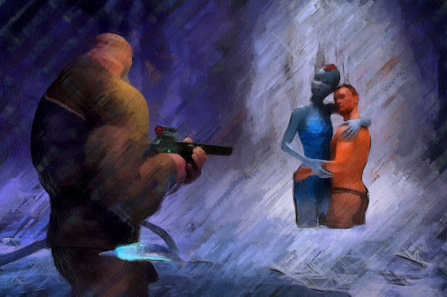
Surprises! Sketchy version.

I like dramatic pictures. I also like setting up more than one layer of action in order to give a picture extra dramatic tension.

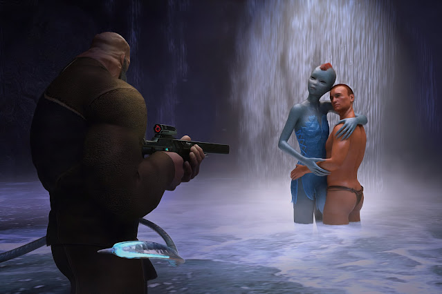
In Surprises! the first layer is the two lovers getting interrupted, and surprised, by a large, hulking, and armed figure.

The second layer is the tentacle to the left, sneaking around the body of the armed man, who is in for a surprise of his own.

Surprises! Final version.

With two layers of action, the resolution of the story will depend on the order of events. Will the brutish figure attack the lovers before he is attacked himself?

That is something I leave up to you. I have my own ideas about what will happen of course, but I won't tell. The idea is to make you, and everyone else who views the picture, participate by weaving your own tales about what will happen.

Be seeing you!


Wednesday, 10 August 2022

Planket 2022 - On the 3rd of September


Time to exhibit some of my work again. First time since 2019, so I am a bit nervous. I have also realized that my pictures push the boundaries of convention pretty far, which makes me even more nervous.

It is, of course, perfectly okay for art to be scary. Art should make us think and feel. It does not have to make us comfortable.

Now, I'd like to emphasize here that my pictures are perfectly okay, by the standards of the 70's, 80's, and 90's. It's just that we, as a society, have changed, and become a bit narrow minded. What was perfectly normal to have on a pocket book cover in 1980, is considered risqué today.

We will see how it works out. Nervous or not, I'm looking forward to the event. A lot!

Planket is a pretty big event. About a hundred photographers exhibit their work. Each one has got a one meter wide area along a fence at Nya Allén in Gothenburg. I've got nine pictures, printed on canvas, so I can't show them all at once. Instead, I'll switch pictures once or twice an hour.

Genres range from Science-Fiction, to Horror, to folk tale-ish Fantasy, to Lost World/Cavewoman.

If you happen to be in Gothenburg on the 3rd of September, come look me up. The exhibit is on from 12 o'clock, to 6 p.m. The address is Nya Allen 1.

About the picture: The author Lennart Guldbrandsson modeled for Blind Fury. You will get to see the whole picture, and many others, at the exhibition.

Sunday, 3 July 2022

Nudity in Art: A Virtue or Vice?

A couple of years ago I came across an article by Brian Yoder with very well thought through observations about nudity in art. If you like to read this blog, you might want to read his article too:


That's it. More posts soon. I've been busy, but I'll try to get back to writing a bit more.

Monday, 7 February 2022

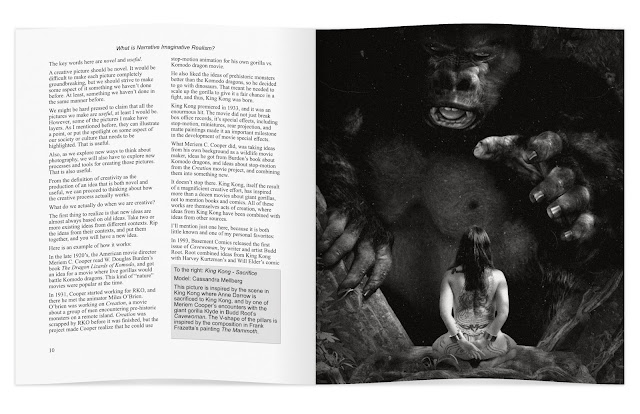
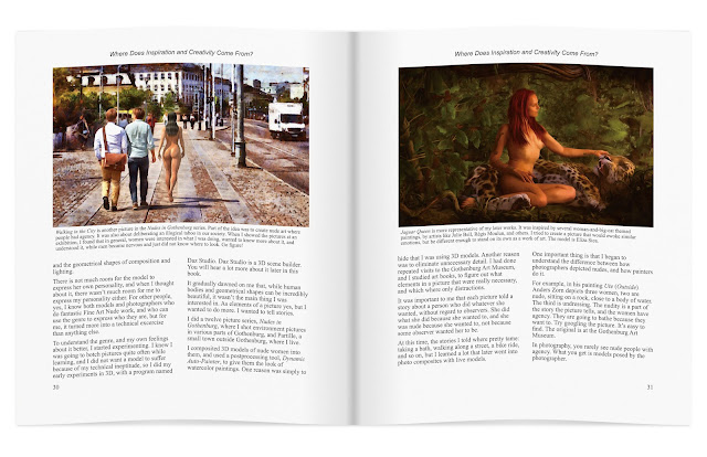
I'm writing a creative photography book!


Drawing photography inspiration from King Kong isn't a new idea. William Mortensen did it in the 1930's. I'm revisiting Skull Island with the help of 3D, and the model Cassandra Mellberg.

I'm writing a photography book! It's about creative photography, and it's shaping up to be different from any other book on photography I've seen.

Most photographers learn exclusively from other photographers. I believe that is a mistake. We should learn from each other, yes, but we also need to open up to learning from other sources: realist and imaginative realism painters, comic book artists, 3D artists, movie makers, and writers.

We need to understand our own history, because photography did not begin with the f/64 group, and there is great value in what was before. We even need to go beyond the arts, and learn from other sources, like neuroscience.

I'm striving to tie many different threads together into a coherent whole, and I'm doing my very best to make it entertaining and fun.

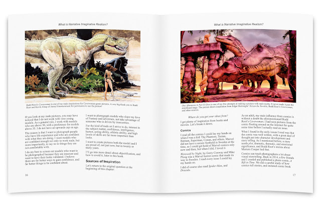
Left page above: I draw a lot of inspiration from comics, so I was more than delighted when Amryl Entertainment gave me permission to use a picture by Budd Root in the book. Budd Root is the author of the comic Cavewoman.

Right page above: I am storyboarding my ideas using 3D software. This allows me to plan my pictures in ways I could not do if I just picked up my camera and shot whatever was in front of my lens. This storyboard, One Afternoon in Pal-Ul-Don, draws inspiration from E.R. Burrough's Tarzan books.


I strive to have something eye-catching, and something useful, on every page spread. From time to time, I will publish a draft page spread, and check the responses to see if I am on the right track.
 various ideas on 
I expect the book project to keep me occupied for about a year. During that time, I also need to do at least a couple of photo sessions, to get material that illustrates various ideas and techniques.

I do hope you will enjoy reading the book as much as I am enjoying writing it!

Sunday, 4 July 2021

Symbolism: Slaying Raptors, Gods, and Our Most Cherished Delusions


Raptor Slayer

You may have noticed that there are a lot of symbols in my pictures. I also tend to stick with certain themes, though I do make the occasional deviation.

Let's have a look at two recent storyboards, and decode some of the symbols in them. We'll start with Raptor Slayer above.

At first glance, what you see is probable something like nude woman stabbing over-sized parrot with teeth. That is certainly one way to look at it, but there is a little bit more to it:

I see a woman mastering her fear, and despite her vulnerability, that's the nudity, fighting very hard to accomplish the almost impossible, i.e. killing a raptor with a bone knife.

I find that never-give-up-even-in-the-face-of-great-difficulty attitude both admirable and attractive, so yes, the nudity makes symbolic double duty.

Of course, as an observer, you will have your own way of interpreting the picture, based on your values, your experience, your knowledge of the Lost World genre of literature, movies, and art, your social context (i.e. the opinions of your friends, and other people who influence you).

Nubian Queen I: The Death of Sobek

The Death of Sobek is about the importance of critically evaluating our own beliefs, and, when those beliefs do not hold up to scrutiny, killing them off and replacing them with something new and better.

Unexamined beliefs, beliefs that are unsubstantiated by evidence, and who do not hold up to even cursory scrutiny, tend to rule our lives.

For example, you might believe that the best way to boost the economy, is cutting taxes for the rich, so they can invest more, and thus create more and better jobs. Well, according to research on tax cuts in 18 OECD countries, that is not how it works. All that happens when you lower taxes for the rich, is that they get richer:

“Our findings on the effects of growth and unemployment provide evidence against supply side theories that suggest lower taxes on the rich will induce labour supply responses from high-income individuals (more hours of work, more effort etc.) that boost economic activity. They are, in fact, more in line with recent empirical research showing that income tax holidays and windfall gains do not lead individuals to significantly alter the amount they work.”
-The Economic Consequences of Major Tax Cuts for the Rich, by David Hope, Julian Limberg

Feel free to disagree, but if you do, bring research that support your views.

The supply side economics scam has kept political parties alive, and sometimes in power, for decades, to the detriment of all of us, except the very rich people who benefit from the tax cuts.

There are plenty of other common beliefs that do not stand up to scrutiny:

For example the idea that a company can maximize its profits by having everyone work as much as possible all the time. This is an idea from Frederick Taylor's Scientific Management. The problem with it, is that if everyone works at full capacity all the time, you get enormous queues of unfinished material, so-called Work In Process (WIP), in your processes. In extreme cases, you get so much WIP, that nothing ever gets finished. This sometimes happens in software development, but it can, and does, happen in other areas too.

There are plenty of ways to reduce, or eliminate, the problem. In management, you can use Lean, Theory of Constraints, agile software development methods, the Deming Knowledge System, IOHAI, and other methods.

Most companies who implement these methods and frameworks do so, not because they understand how they can help alleviate the problems, but because it has become a fad. When you do that, you will almost certainly do things that short-circuit the new way of doing things, so that you go through the motions, but never get the benefits.

For example, agile methods, mentioned above, rely on something called vertical slicing to create work packages that can be implemented with an optimal balance between capacity cost and queueing cost. Over the past 20 years, nearly every company I have seen, has fallen into the trap of doing horizontal slicing, i.e. requirements are functional, rather than representations of something that has economic value on its own.

As a result, lead times can explode. I have seen lead times go up by a factor of 50, and more, because of this. That means you would have to wait for two years to get something that could be built and delivered in two weeks. Thus, you loose the money you could have made by using that functionality for two years.

Another favourite: You want to implement one of the methods mentioned above, and realize you need new processes, so you decide to invest in a tool for creating the new processes. Looking around for a good, safe, alternative, you decide to go with something like IBM Blueworks. Nobody gets blamed for buying from IBM!

What you do not realize, is that all of these new methods and frameworks, separate process material flow from the flow of directives, and that the flow of directives go in the opposite direction from the material flow. The reason for this, is that it is much easier to reduce the amount of WIP, and thus queueing costs, that way.

Blueworks does not allow you to design processes like that. It does not separate material flow from flow of directives. Topping it off, the economic simulation in Blueworks takes only capacity cost into account, which means you are liable to design processes with sky-high queueing costs.

Suddenly, your unexamined beliefs about tax cuts, how to write requirements, or which tool to use, has become your Sobek, your crocodile god demanding human sacrifice.

It's not just about whether you can slay it, you probably do not even know that you should, and you live in a society of Sobek worshipers that will punish you if you try.

I bet you did not think of Nubian Queen I: The Death of Sobek in those terms. Symbolism is tricky, and symbols can be open to an infinite variety of interpretations.

Because of this, the symbolism in a picture is liable to misfire if we do not talk about what it represents. Often, a picture is just a cool image, without deeper connotations, but we won't know that either, unless we talk, or write, about the picture.

So, lets talk about the pictures we see, and the pictures we create. Otherwise, their meaning can all too easily get lost.

Be seeing you!

Saturday, 29 May 2021

Learning from Julie Bell and Jamie Chase


Thanks to Julie Bell and Jamie Chase, both great Fantasy artists, I can show you how to draw inspiration from masters, to improve your own creativity and skill.

Both Julie Bell and Jamie chase publish their art on Facebook. 

Julie Bell: https://www.facebook.com/julie.bell.589 
Jamie Chase: https://www.facebook.com/jamiechasearts

---

Getting Covid-19 in the beginning of April hit me pretty hard. I am recovering though, and I am starting to take interest in things again: Starting a new job on Monday, working on a picture or two, occasionally working on a book, working on getting my photo sessions going again... I am still a bit careful where and when I spend energy though. I expect to recover fully, but it may take quite some time.

The upshot is that I'll probably blog a bit less frequently than usual. In a few months, maybe, I'll pick up speed again.

Fortunately for me, while being sick, and throughout recovery, I've had great support from my family. It has made everything so much easier. Speaking from experience, you really do not want to get Covid-19, and you really, really, do not want to infect relatives and friends, so please be careful out there.