 | ||
| The Pit - Digital Painting Version |
I'll walk you through the process I followed to create the image, and show you a few of my intermediate versions of the picture.
Be warned: There is some full frontal, albeit digital, nudity ahead. The first versions I created in Daz Studio used default lighting. My intent was to get an overall idea of the picture before I added lighting for mood and modesty.
I began building the scene in Daz 3D using stock 3D models. My first image used the 3Delight renderer, and default lighting.
In hindsight, this was a mistake. I should have used the Iray renderer, that also comes standard with Daz 3D, from the start, because the lights created with 3Delight and Iray are completely different. The 3Delight lighting setups I created became completely useless when I switched to Iray, so I had to relight the whole scene.
Originally, I wanted the whole picture to be done in shades of green. The idea was to associate with the deep, dark sea, deep ones, and Cthulhoid monsters in the depths.
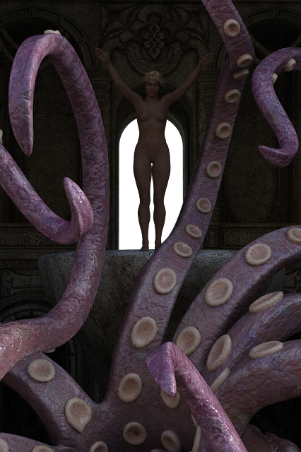
That did not quite work out. The picture above is my 5th render. As you can see, I have changed the lights. There are two spotlights from above, one from below, and one behind the woman, lighting the wall behind her. Originally, I wanted to light the wall with the spotlight from above, but that did not work out very well.
I did briefly experiment with using a sktetch filter in Comic Life on my original base image, but I abandoned the idea. Still, there are things about the image that I do like.
Instead, I blended two of my base images together using Affinity Photo. It looked failry good, but I decided to relight everything so I could use the Iray renderer instead of 3Delight.
Above is a base image rendered using the Iray renderer.
After a few more renders, and a bit of tweaking in Affinity Photo, I had the image above. I thought it did look a bit too stiff and artificial, so I decided to experiment with the painting tools in Affinity Photo.
Here is the final result again. I used a brush from the Paint brush set, and the Paint Mixer tool to paint over the image. I was careful to follow lines in the original image with my brush strokes. That way, I kept as much detail and shadowing as possible.
I used the default 70 pixel brush for most of the picture, but reduced the brush size to 20 pixels to paint the woman, and other parts of the picture that needed to retain small details.
That is it! A small rendering and digital painting experiment, but I learned a lot. Also, I have a storyboard that might be the basis for a composite photo.


No comments:
Post a Comment